Link copied to clipboard.
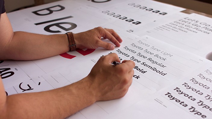
Typography
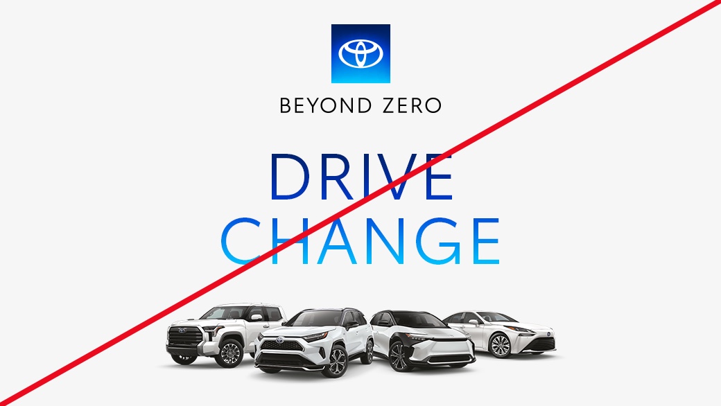
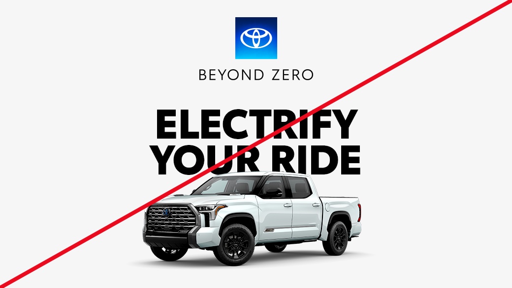
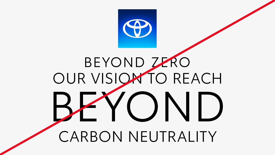
BEYOND ZERO
The Beyond Zero type style uses Toyota Type for brand recognition while leveraging the Book weight to bring a sleek, future-forward look to Beyond Zero communications.

Link copied to clipboard.
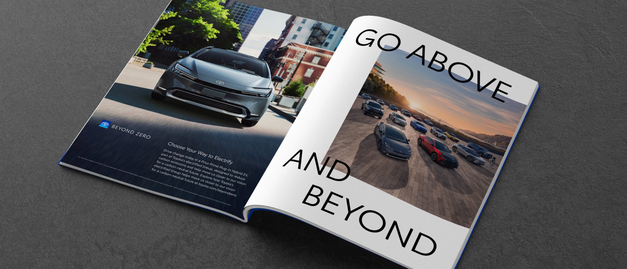
Typesetting
Like other Beyond Zero elements, this type style is designed for use in communications about our vision and electrified lineup. Headlines and subheads use Toyota Type Book exclusively and should not be treated in lighter or heavier font weights. Supporting copy, as outlined in the Messaging Guidelines, may be typeset as a subhead or body copy, depending on length.


Link copied to clipboard.
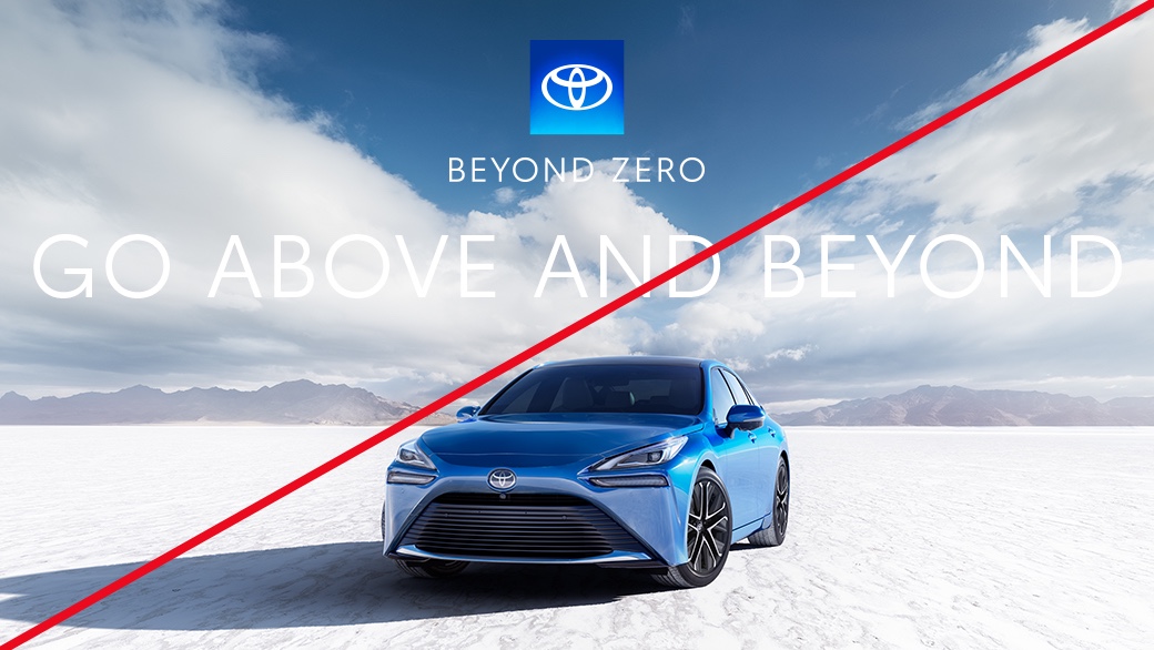
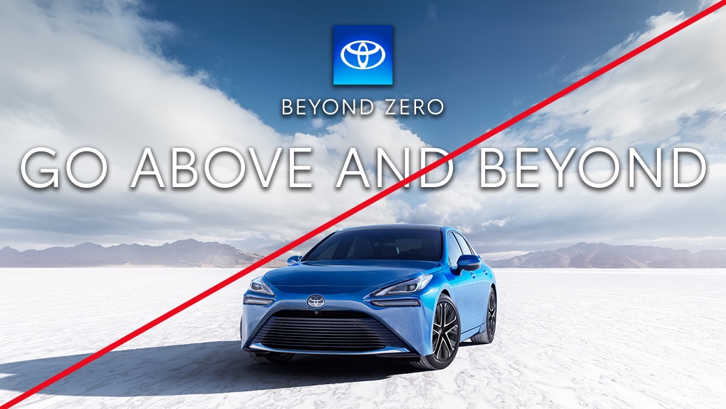
Typography Watchouts
Link copied to clipboard.
Resources

