Link copied to clipboard.
Typography
Clear and legible, yet still expressive and exciting, our typography captures Toyota’s essence in every word. When it’s used consistently, brand recognition becomes effortless.

Link copied to clipboard.
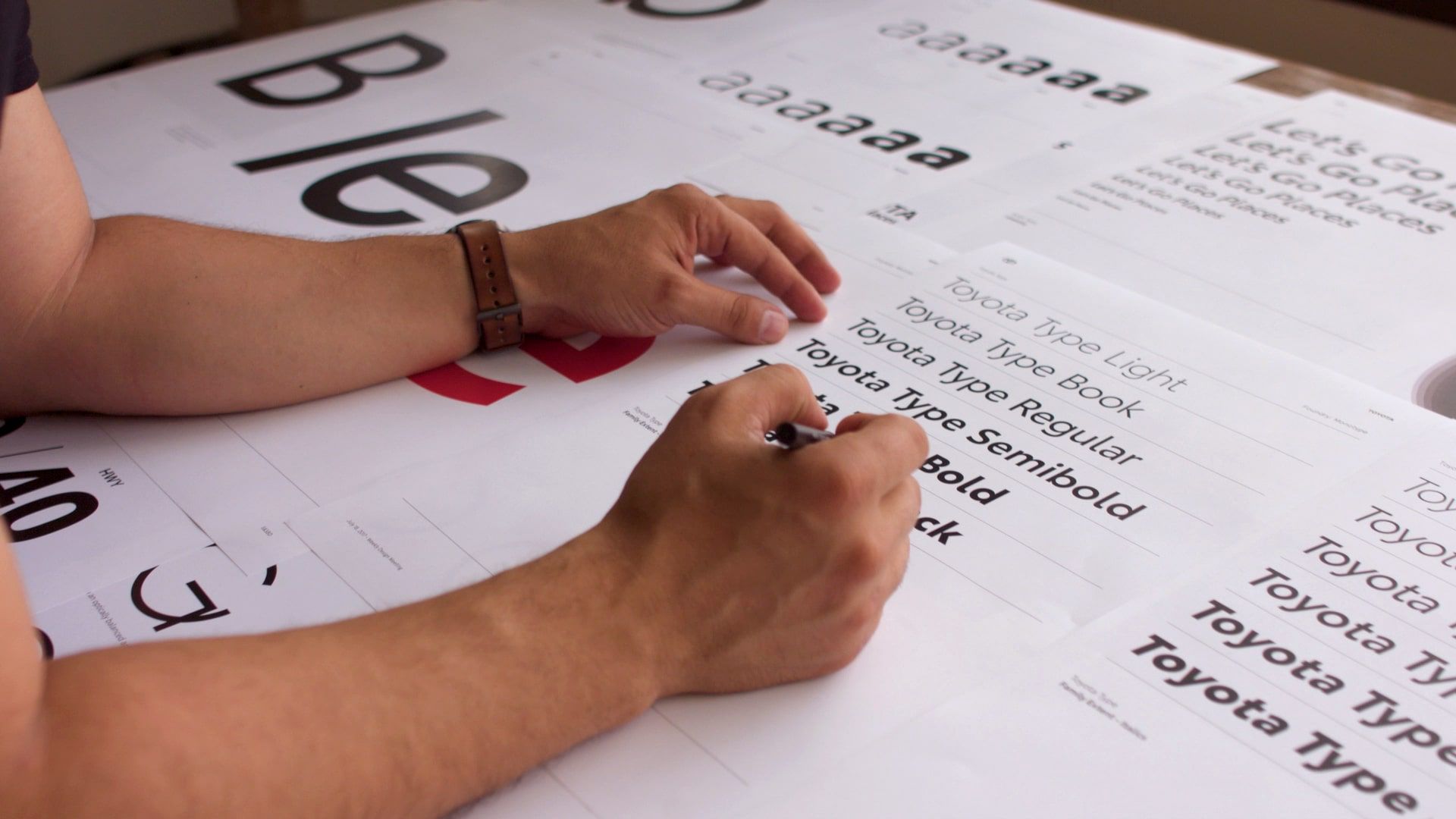
Toyota Type
On a small screen or big billboard, in bold headlines or the fine print, our custom font is designed to be legible, human and approachable.


Link copied to clipboard.
Creative Expression
Toyota Type can bring messaging to life in many ways across our broad array of vehicles, products and services. Here are some tips for using our font’s versatility to give the right feel to your project.


Link copied to clipboard.
Typesetting
Ready, set, type. Ensure legibility and consistency by following these best practices.


For numbers used within a headline, use the same font weight as the headline.

For numbers separate from a headline, varied scale and font weights may be leveraged to create a clear hierarchy. Align the baseline of the last line of support text with the number baseline.

When working with a limited amount of screen time, prioritizing key messaging is crucial. Supers may leverage scale to make sure the most important takeaways are impossible to miss.

This configuration from the Animated Supers toolkit uses structured, full-justified type to organize the information in an elegant and sophisticated way.

When left-aligning headlines, use hanging quotes. Essentially, align the text to the left side and add the left quotation mark separately.

When center-aligning headlines, exclude quotes and periods from the alignment. All other punctuation should be included in the center alignment.
Link copied to clipboard.
Watchouts
Keep things on-brand by steering clear of these mistakes.


Link copied to clipboard.
Resources

