Link copied to clipboard.
Layout
Layout

Designing a layout is a fundamental part of any communication. Keeping it clean, neat and consistent brings our brand elements together and strengthens every message.


A layout of different Toyota vehicle ads.


Link copied to clipboard.
Using Grids
Using Grids

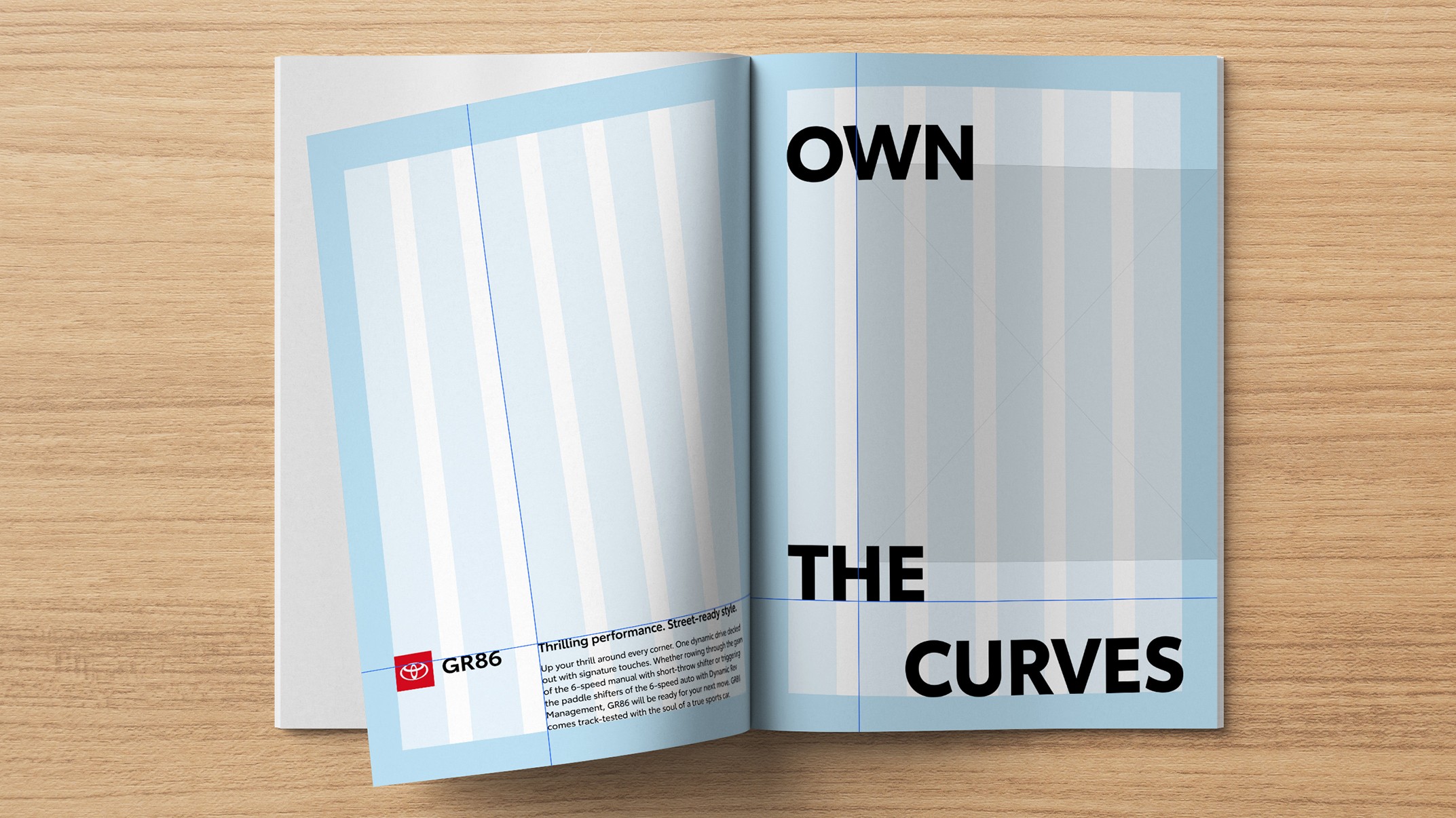
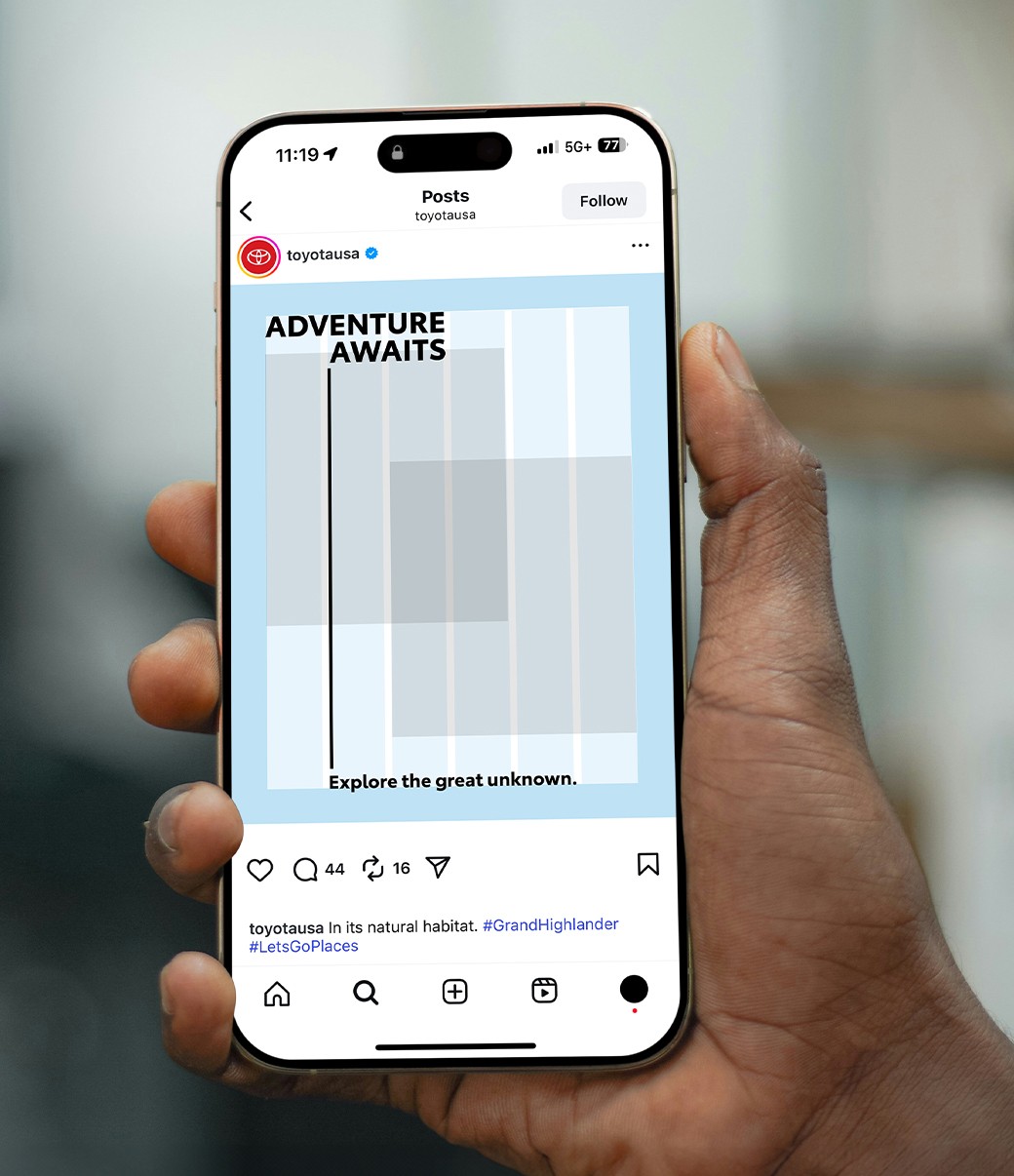
In design best practices, we use a simple grid to align page elements based on sequenced columns and rows. This column-based structure guides the placement of text, images and other design elements, helping create balance and consistency. Depending on the application and layout size, you can utilize anywhere from a 2- column to a 12-column grid system.


Link copied to clipboard.
Margin and Clear Space

Determine minimum margin and clear space using the staging platform of the logo to determine the “X” value.


Link copied to clipboard.
Alignment
Alignment

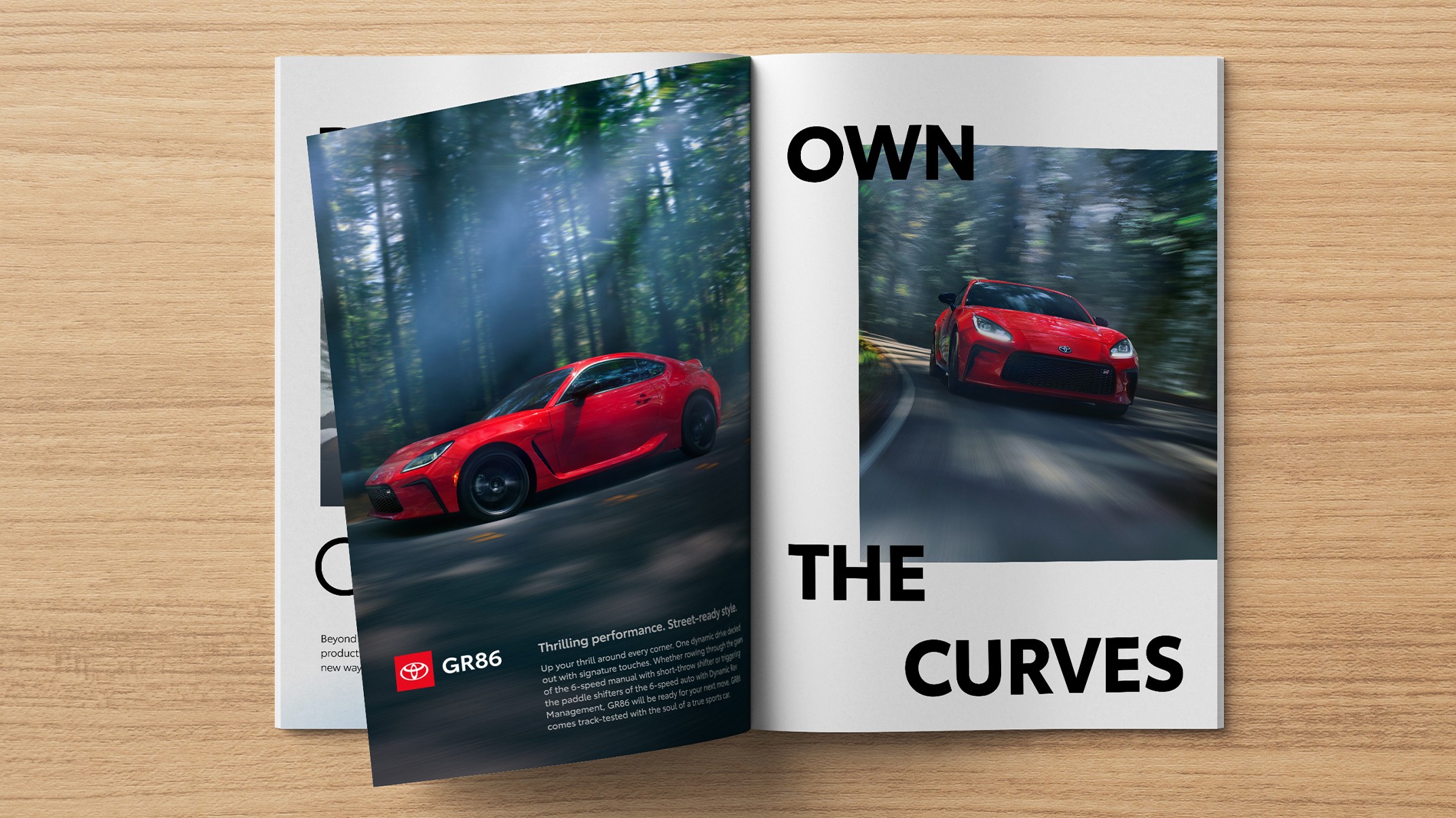
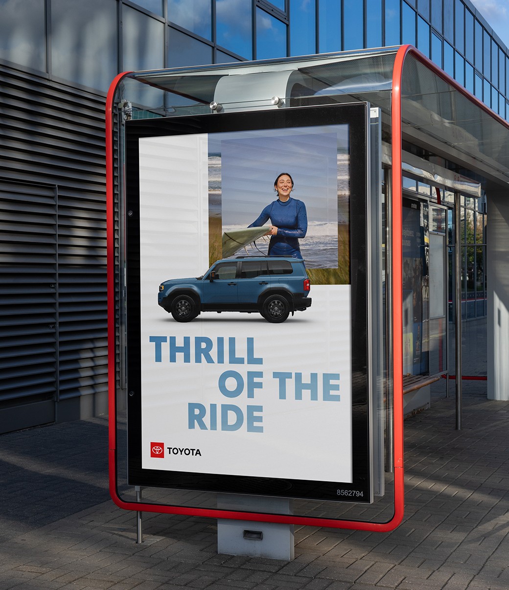
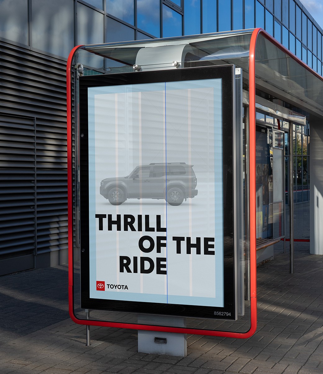
Accurately aligning your composition gives it a sense of structure and balance. Look for opportunities to align key elements, as illustrated below.


Link copied to clipboard.
Working with Motifs
Working with Motifs

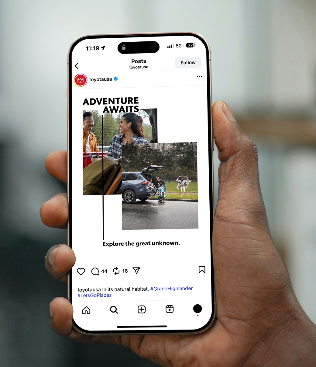
Depending on the communication’s content and general tone, you can play with different layout styles to make it more impactful or to enhance legibility.


Graphic Band
Graphic Band

An optional graphic band can house body copy when it can’t be used over an image. The band height may be from 1/8 to 1/4 of the layout. When placing copy to the right of the logo, align the top of the copy to the top of the black Toyota wordmark.

Full-Bleed
Full-Bleed

In image-dominant layouts, photography can bleed off all sides. This is best suited for small amounts of copy.

Editorial
Editorial

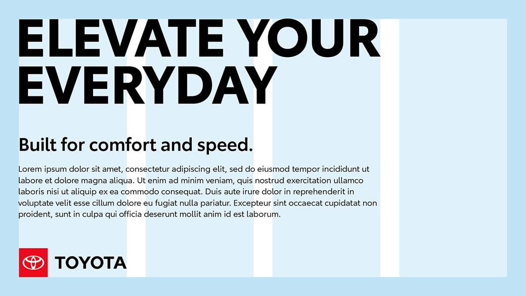
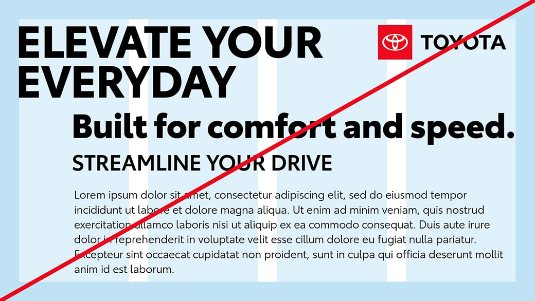
Using multiple text boxes within the grid system can organize copy-heavy layouts.


Link copied to clipboard.
Layout in Action
Layout in Action

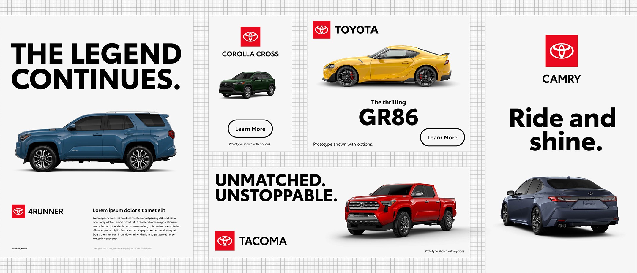
Get some inspiration and put it all together in expressive ways that support the message and the brand, no matter what media you’re working in.


A slider divides an image of a Toyota ad in a magazine. The slider moves back and forth to show a layout grid of the ad and then the finished layout with imagery.


A slider divides an image of a hand holding a phone with a Toyota social media post. The slider moves back and forth to show a layout grid of the post and then the finished post with imagery.


A slider divides an image of an out-of-home board. The slider moves back and forth to show a layout grid of the ad and then the finished ad with imagery.


Watchouts

Here’s a summary of basic design principles that can help ensure a successful layout.


An example of a balanced and aligned layout on a grid with a headline, sub head, body copy and logo all left-aligned.


Utilize negative space to create visual balance.


Create a clear hierarchy to draw the eye to the most important information first.


Use alignment to create balance and structure.


An example of an incorrect layout on a grid with misaligned elements, overly large text and elements too close to each other.


Don’t overcrowd the layout.


Don’t allow competing elements to be displayed at the same scale.


Don’t place elements arbitrarily or let them float off-grid.


Link copied to clipboard.
Resources
Resources


Logos Guidelines

Explore all Toyota logos and learn how to use them for maximum impact.


Typography Guidelines

Check out our best practices and get creative examples for using typography in your layout.