Link copied to clipboard.
Iconography
Iconography

Toyota's Iconography System complements our brand personality with a style that's simple, modern and relatable. Learn how to use, create and design unmistakable icons. These guidelines cover all the steps, from concepting to fine details.


A magazine displaying a variety of Toyota icons.


A graphic of a file folder with red and white boxes.


Get Started With Our Sample Library

To see our style in action, check out our starter library with a few examples of core icons in various sizes.


Terminology

Refer to this legend if you need help with any terminology along the way.


A module points out six different parts of an icon.


1. Corner Radius


2. Inner Corner


3. Counter


4. Stroke Weight


5. Stroke Cap/Terminal


6. Padding


Icons on this page are not displayed to scale and have been enlarged for demonstration purposes.


Link copied to clipboard.
Concepts
Concepts

An icon is a simple visual story that portrays an idea, object, action or all three. These are our preferred methods to visually convey a concept.


A wrench icon.

Abstracted

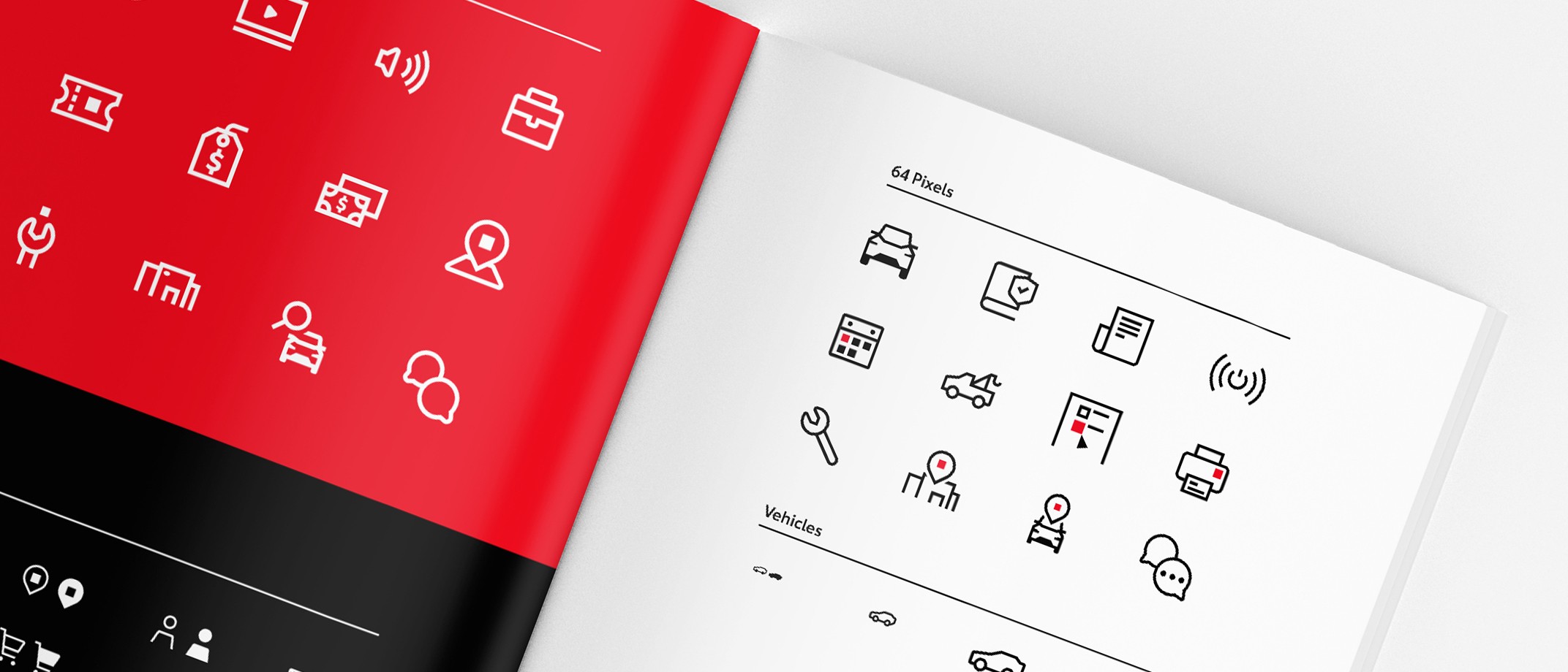
Abstracted icons refrain from being too literal and hint indirectly instead. For instance, this “Price Builder” icon uses a wrench to imply building something.


A ticket icon.

Literal

You can also depict the concept directly as it appears in reality. In this example, a recognizable ticket is used as an icon to represent "Events."


A building icon with a pointer icon above it.

Nested

Nesting adds another graphic element to the design, like adding an action to an object. It gives opportunities to create a narrative or add more meaning.


Building Narrative

As icons increase in size, we gain space for detail to tell a more specific narrative. In this example, we start with the basic idea of a search and add more details to expand the story.


Adding Signifiers

Another way to add more meaning is to use a signifier to modify existing icons. In the example below, the signifiers on the right can be applied to the icon on the left to add clarification. For instance, the certified signifier added to the vehicle icon now communicates "Certified Vehicle."


Link copied to clipboard.
Our Style
Our Style

Our style transforms these concepts into modern, relatable and simple designs. Approachable without being overly playful, our design elements are engineered to match our brand personality.


A collage of different icons against black, white and red backgrounds.


Making It Iconic

At the core of our style are three design elements that hint at iconic features of Toyota’s brand.


A vehicle icon with a dotted line showing the angle of the vehicle roof.

Angles

Nod to the foundational structure of Toyota’s vehicles by using angular forms where applicable.


A building icon with a red ellipse in the upper corner.

Ellipse

Hint at the Toyota legacy logo by using the oval silhouette from the logo mark (apply sparingly).


A ticket icon with a red square inside.

Square

Connect to our Toyota staging logo by using the square (apply sparingly).


Using Filled Shapes

To make these design elements stand out, we use filled shapes for the ellipse and square, in addition to two other specific situations.


Vehicle icon with tire and grille shapes filled in.

Enclosed Shapes

Fill in an enclosed shape if the negative space is smaller than 1px for 16px icons, 2px for 32px icons, or 3px for 64px icons.


Pointer icon with black square.

Logo Reference

When using the legacy or staging logo shapes within the icon, fill in the corresponding oval or square so it stands out from the rest of the icon.


Credit card icon in white and black.

Filled Style for 16px

Where applicable, an alternate version of a small 16px icon may be created with a simple, filled shape.


Working With Angles

Angles are a key feature of our style. Look for opportunities to apply them in different ways.


Vehicle icon with blue lines highlighting various angles.

To reflect Toyota’s angular styling, apply repeating angles where possible, especially on vehicles.


A graphic showing correct and incorrect use of diagonal grid lines.

For more subtle angle use, consider creating diagonal grid lines. This ensures shapes are visually aligned on a consistent angle.


Combining Geometric Elements


Elements

To create a cohesive system, we use a combination of the following geometric elements.


Wrench icon with bottom terminal highlighted.

Square Terminals


Wrench icon with a square above highlighted in blue.

Perfect Squares


Wrench icon with the circular shape of the wrench body highlighted.

Perfect Circles


Wrench icon with blue lines indicating the angles in the shape.

Angles


Chart graphic with various angles highlighted in blue.

15° Increment Angles


Wrench icon with negative space highlighted in blue.

Consistent Negative Space


Corners

Corners are given slight visual interest by using a variety of the following graphic treatments. Feel free to mix and match.


Graphic of a corner using corner radius.

Corner Radius

Use a 1px corner radius for 16px icons, a 2px radius for 32px icons, and a 3px radius for 64px icons.


Graphic of a corner using a round join.

Round Join

To use a round join, round the exterior corners but keep the interior corners sharp.


Graphic of a corner using a miter join.

Miter Join

To avoid overly sharp corners, only use a miter join for angles more than 90°.


Adding Color

Like our logo, all of our icons pull from the core Toyota color palette for easy recognition.


A black icon over a white background next to a white icon over red background.

One-Color

Black or white is preferred for all single-color iconography. Small 16px icons are always one-color, never two-color.


A black-and-red icon over a white background, next to a white-and-red icon over a black background.

Two-Color

For 32px and 64px icons, a red square or oval may be added to a black or white icon if referencing the legacy or staging logo shapes. The red square should be between 1/3 to 1/6 of the icon’s width.


Link copied to clipboard.
Size
Size

We have three preferred icon sizes. For every increase in size, 1px is added to all graphic specs (stroke weight, padding, negative space, etc).


Standard Sizes


A small-size vehicle icon.


Small 16px

Small icons use simple outlined shapes or filled shapes when applicable. They are always one color with minimal details. Focus on the bare essentials to communicate the concept.


Specs
  • 1px stroke weight
  • 1px padding
  • 1px corner radius (where applicable)


A medium-size vehicle icon.


Medium 32px

This is the most commonly used size with options for one- or two-color. Details are minimal, but there’s room to subtly accentuate the concept with a few small details.


Specs
  • 2px stroke weight
  • 2px padding
  • 2px corner radius (where applicable)


A large-size vehicle icon.


Large 64px

Large icons present more options for stylistic details, angles or brand references. Details should still be simple and used sparingly. Icons may be one- or two-color.


Specs
  • 3px stroke weight
  • 3px padding
  • 3px corner radius (where applicable)


Standard Sizes in Action

Each icon size plays a different role in communicating with our customers. See the applications where they work best in the examples below.


Grids

Each size has a unique grid. The grid allows for consistent structure across all icons. You can also use keylines to guide the structural geometry for each icon. Think of grids and keylines as flexible lane markers rather than rigid guardrails. Below are the three different grid sizes to use when making an icon.


Fine-Tuning

Following the keyline structure helps maintain visual weight across the icon. However, extending past the keylines is welcomed to preserve the integrity of a concept. In these examples, the outlines extend past the keylines to accurately illustrate the form of their respective objects.


A wrench icon with blue gridlines.

Proportions

In this example, the keylines would hinder proper proportions for depicting the object accurately. The top of the wrench would appear too small if adhering to the vertical rectangle.


An icon with two rectangles extending beyond the blue gridlines.

Visual Weight

In this case, the keylines would make the objects look too small if they were strictly confined to the grid. So to give the objects enough room to “breathe,” we can break past the guides while still using them for structure.


A pointer icon over a rectangle with diagonal and circular gridlines.

Balance

Here, keylines would make the top and bottom elements feel unbalanced if they were strictly contained. To get a similar visual weight, we can break past the lines while using a diagonal grid to maintain consistency.


Sizing Watchouts

You can create an icon in multiple sizes, but always ensure designs appear visually consistent when resizing. Redesign, don’t scale.


A graphic showing vehicle icons that have been correctly resized.


When creating an icon in a different size, redesign it according to the approved specifications.


Whenever adding details, check at 100% scale to make sure they read well.


A graphic showing vehicle icons that have been incorrectly resized.


Don’t scale a design to reuse at a smaller or larger size, as the details will not look consistent.


Link copied to clipboard.
Illustrative Graphics

We have a select group of illustrative graphics available for internal and limited use only. They should not replace the icon styles above and are intended for large-scale applications. Download here.


Various illustrated graphics over a red background.


Link copied to clipboard.
Resources
Resources


Grid Templates

Download blank template Illustrator files with grids and keylines to start your designs on the right page.


Sample Iconography Library

Build on premade designs with this editable icon library. You’ll find core icon examples in all three sizes.


FAQs


  • Please review the existing icon library to accommodate your need.
  • You can use the iconography guidelines to customize any existing icons or create a new one. 

Please send any icons you’ve created to the Toyota Brand Team at brand@toyota.com. We can review and add to the download library for others to use.