Dealer Logos
DEALERSHIPS

Leveraging the strength of our iconic brand is a powerful way to boost your dealership’s presence. Whether you’re refining an existing logo or starting one fresh, this resource offers options to optimize it for maximum impact. This guidance is not mandatory but provided for dealers who want to align more closely with our brand.


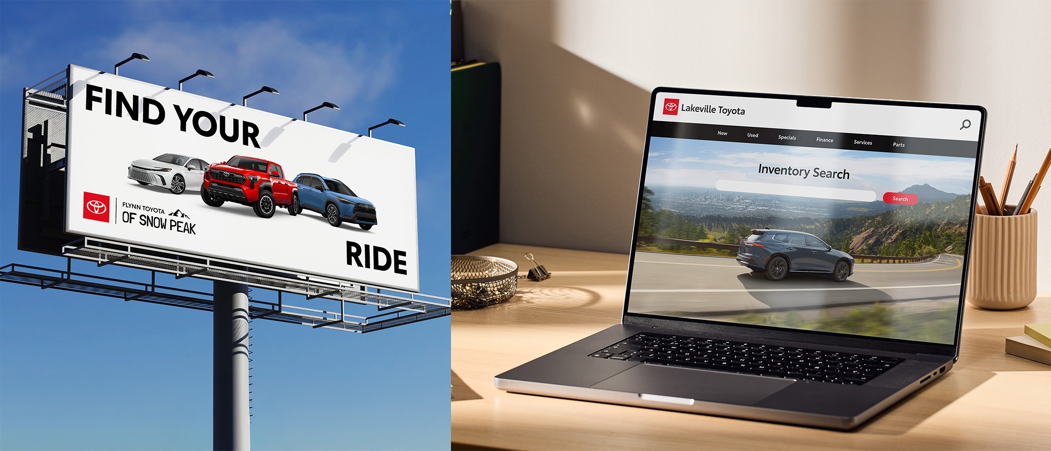
An image of a dealership billboard with a dealer co-brand logo in the bottom left. Next to this image is an image of a laptop screen with a dealership website and a typeset dealer logo in the top left navigation.


Toyota brand logo image


Core Brand Logo Guidelines

For guidance on clear space, minimum sizes, color variations, co-branding and general logo watchouts, please visit the core brand logo guidelines.


Link copied to clipboard.
Leveraging the Toyota Brand

As Toyota is an ever-evolving brand, its expression has taken varied forms over the years. We’ve created these logo options to sync with the current core elements of our visual identity. By unifying your dealer logo with these elements, you can help make our brand more unmistakable than ever.


Toyota Logo Example.
Staging Platform

The staging platform is the foundation for all our Toyota logos. It can help connect the power and equity of the Toyota brand to the unique identity of your dealership.


An icon with the letter T
Toyota Type

Toyota Type is custom built to represent the Toyota brand and maximize legibility. It boosts recognition when used for the word “Toyota” in your logo.


An icon of a painter palette with red paint
Toyota Red

Not all red is Toyota Red. It’s a proprietary shade (#EB0A1E) that, when used in your logo, matches our brand elements and unifies the look and feel.


Link copied to clipboard.
Dealer Logo Styles
Dealer Logo Styles

Dealers can choose from two main logo styles: Typeset or Co-Brand. The Typeset style features the staging platform and Toyota Type only, while the Co-Brand style can leverage additional unique fonts, colors or graphics.


Dealer Typeset logo example


Dealer Co-Brand Logo example


Lockups Made for Your Dealership Name

We offer a variety of Lockup Templates that accommodate a range of dealership name lengths, hierarchies and styles. These templates are grouped together based on where "Toyota" falls within the name.


Dealer Typeset logo example


Dealer Co-Brand Logo example


Toyota brand logo image


Dealer Logo Lockup Templates

Editable Illustrator templates are provided for all lockup variations shown in the following two sections. Use them as a starting point to create or modify your unique dealer logo.


Dealer Typeset Logo

Optimized for legibility in website headers, layouts and more, the typeset logo style uses Toyota Type Semibold and fits right in with our core logo family. Typeset logos can flex to be horizontal or vertical and use title case or all caps


Using this logo style is a recommendation. If you opt out, see the Corporate Considerations section for more information.


Lockups

Every dealer has a unique name with varying character counts and structure. Browse a variety of typeset lockup templates to find a typeset logo that works for you. For simplicity, all examples shown are horizontal logos in title case, but logos may also be vertical or use all caps.


Dealer Co-Brand Logo

Co-branding combines Toyota’s iconic logo with the unique equity in your dealership. This logo style uses additional fonts or subtle accent graphics to celebrate a dealership’s identity and make names or locations stand out. It is preferred to treat the word “Toyota” in Toyota Type. Because these logos use additional fonts and/or graphics, these logos use a divider line after the staging platform.


Using this logo style is a recommendation. If you opt out, see the Corporate Considerations section for more information.


Lockups

We have a variety of lockup templates that can be used as a starting point for your design. They use a placeholder display font that you can replace with your own typeface. Scale, alignment and placement can shift slightly to accommodate accent graphics, if desired. For simplicity, all examples shown are horizontal logos in title case, but logos may also be vertical or use all caps.


Refining Your Existing Logo

If your existing logo doesn’t fit into the lockups provided above, there are still ways you can make your logo more on-brand. We’ve put together a list of best practices to address some of the most common challenges we’ve heard about from dealers.


Avoid Redundancies

We recommend having the word “Toyota,” the staging platform and the emblem only appear once in your logo. The lockups have removed the word “Toyota” from the logo so it can be included within your name without repetition.


Incorrect redundant examples of logos


Make sure the word “Toyota” only appears once.


Make sure the staging platform only appears once.


Make sure the emblem only appears once.


Use Toyota Type Purposefully

Toyota Type is custom-built for our brand. It is always the preferred font for representing Toyota in text. Consider treating the word “Toyota” in Toyota Type Semibold, preferably in the color black. If you are using a display font for other words in your logo, the display font should have its own distinct look and feel. Avoid other sans-serif fonts that could be mistaken for Toyota Type.


Incorrect logo examples where the word “Toyota” is not in Toyota Type


We don’t recommend treating the word “Toyota” in fonts other than Toyota Type.


Don’t use other sans-serif fonts that could be mistaken for Toyota Type.


Celebrate Toyota Red

If you are using red in your logo, always make sure it is the correct Toyota Red (#EB0A1E) and don’t use any reds that aren’t Toyota Red. Visit our Brand Colors Guidelines to ensure you are using the correct Toyota Red values for both digital and print executions.


For text colors in your logo, we recommend the word “Toyota” appears in black. Other words may use Toyota Red. Unique accent graphics ideally use additional colors sparingly.


Logo examples that use incorrect shades of red


Don’t use any reds that aren’t Toyota Red (#EB0A1E).


Use Graphics as an Accent

The staging platform should be the most prominent graphic element in the logo. We recommend simplifying unique graphics so they are an accent and do not overpower or compete with the staging platform. Scaling back graphics is a recommendation, but not mandatory.


Incorrect logo examples with overpowering graphics


Don’t use graphics at a scale that overpowers or competes with the staging platform.


Link copied to clipboard.
Modification Examples


Make It Balanced


Incorrect “Toyota of Whalebend” dealer logo example. The logo is all blue and uses a large font with whale graphics that are much larger than the staging platform.


Don’t use graphics that overpower the staging platform.

Correct “Toyota of Whalebend” dealer logo example. "Toyota of” is in black Toyota Type. “Whalebend” uses a unique font but in a similar size. Next to the text is a simple black graphic of a whale’s tail.


Do use subtle accent graphics that represent your dealer’s unique personality without being overpowering.


Make It Legible


Incorrect dealer logo example for “Montgomery Toyota of Yellowrock.” "Montgomery Toyota of” is in a small thin font with poor legibility


Don’t use type treatments that have poor legibility at smaller scales.


Correct dealer logo example for “Montgomery Toyota of Yellowrock” with legible text weights and sizes


Do prioritize the legibility of your dealership name to ensure impact at all scales and placements.


Make It Concise


Incorrect dealer logo example that has a tagline in small font and a list of locations included in the logo


Don’t squeeze taglines or non-essential information into the logo, as they can compromise legibility.


Correct dealer logo example that has the dealership name as the only text in the logo


Do use your dealership name as the primary text in your logo. Consider using taglines elsewhere on your website or layout, separate from the logo.


Make it Organized


Incorrect dealer logo example that has the text Bandit Buck’s to the left and Toyota of Nashville to the right locked up with the staging platform


Don’t use a hierarchy or order that is confusing or inconsistent with the templated lockups. The Toyota staging platform should always come first.


Correct dealer logo example that has "Bandit Buck’s Toyota of Nashville” locked up with the staging platform using the co-brand logo template


Do use the logo structure as outlined in the templated lockups to ensure your name is easy to read


Link copied to clipboard.
Logo Usage
Logo Usage

For further guidance, please consult the watchouts listed throughout the core brand Logo Guidelines.


Using With Other Logos

When pairing your dealer logo with other Toyota logos in an application, make sure the staging platform and emblem only appear once to avoid redundancies.


You may opt to typeset the sub-brand or vehicle name instead of using their respective staging platform logos. As an alternative solution, sub-brands, vehicle names or “Toyota” may be included as part of the headline instead.


Note that you may not remove the staging platform from the Toyota logo. In this case, remove the staging platform from your dealer logo.
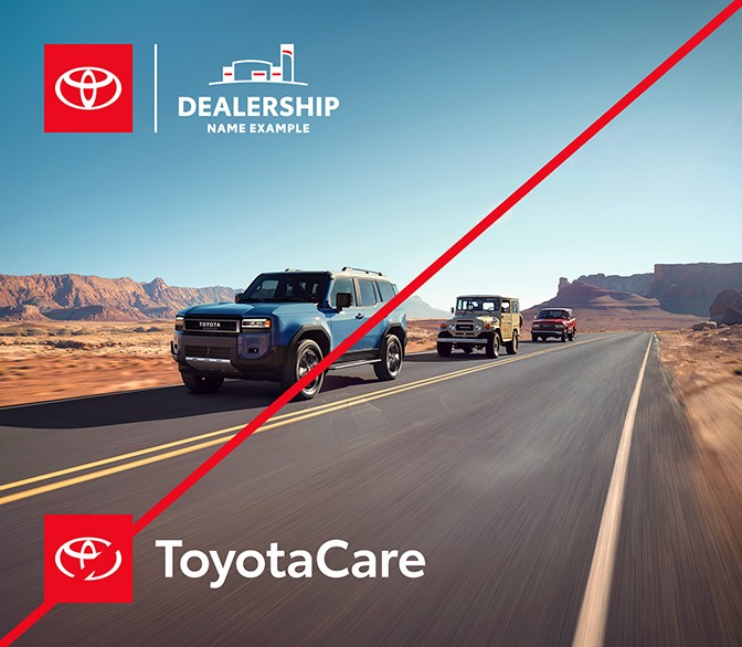


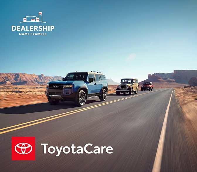
An incorrect example showing a vehicle image with a ToyotaCare logo a co-brand dealer logo.


Don’t use multiple staging platform logos in an application.


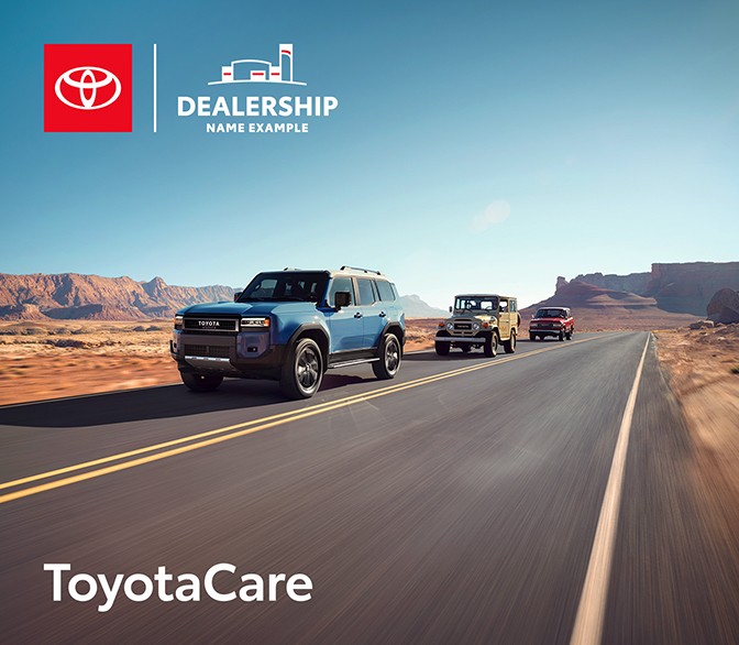
Correct example showing a vehicle image with a ToyotaCare logo and a dealer logo without the staging platform.


Do remove the staging platform from the dealer logo if another Toyota logo is present.

Correct example showing a vehicle image with ToyotaCare in text and a co-brand dealer logo.


Alternatively, you may remove the staging platform from the sub-brand or vehicle name instead.


Using on Your Website

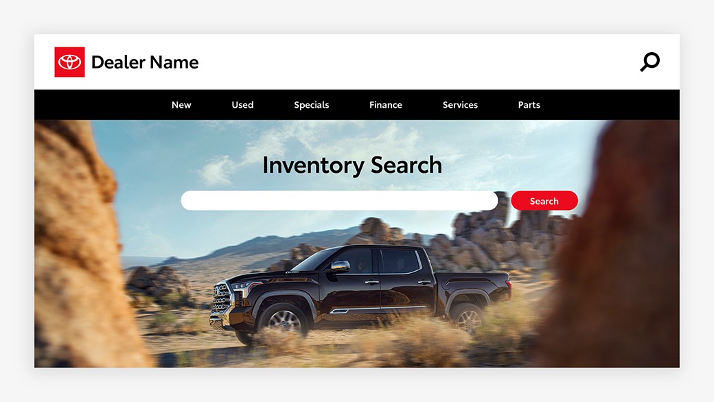
Only horizontal logos may be used in the main navigation. Your dealer name may be treated in black or white to accommodate light or dark backgrounds. If using over a photo, prioritize legibility and ensure there is sufficient contrast between the logo and background. Single-color logos are not permitted for websites.


An inventory search page on a dealer website with a typeset dealer logo on the white navigation bar.


Dealer typeset logos provide optimal legibility on the Web and may be used on white, black or photographic backgrounds.


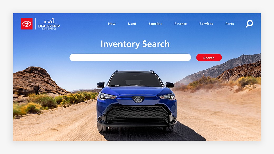
An inventory search page on a dealer website. The co-brand dealer logo in the top left is against a solid background image of blue sky.


Dealer co-brand logos may also be used, but the scale and background should be carefully considered to ensure full legibility is maintained.


Clear Space

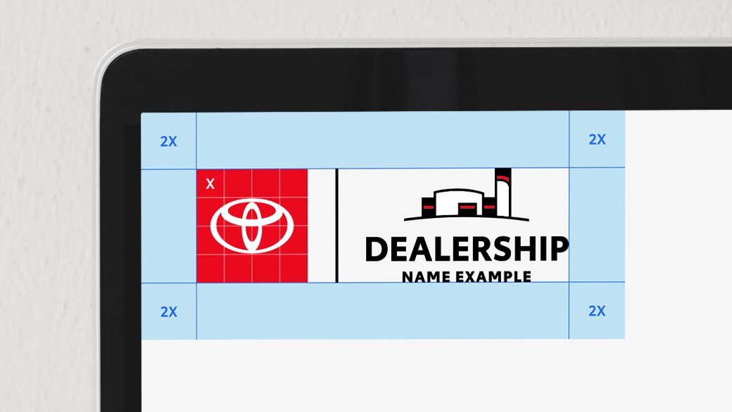
Minimum clear space is 50% of the staging platform height, or 2X. Determine “X” by dividing the staging platform into a 4x4 grid. The clear space should scale with the logo.


o-brand dealer logo lockup surrounded by a blue margin marked 2x. The logo staging platform has a 4x4g grid with an x marked in one square to show how to determine the value of x.


Link copied to clipboard.
Corporate Considerations

If you use the provided lockup templates, please follow the recommendations above. If you choose not to use these styles, please follow the 2016 Corporate Brand Standards for the Toyota Mark and Logotype, especially the following guidelines:


  • Logos must comply with all TMC brand guidelines, paying particular attention to the exclusion zones.
  • Never use the Corporate TOYOTA Logotype independently of the Toyota mark.
  • The Toyota mark may only be used independently if the word “TOYOTA” is treated in an alternative font and does not include the Corporate TOYOTA Logotype.


Link copied to clipboard.
Resources
Resources


Dealer Logo Lockup Templates

Download editable Illustrator templates for all of our dealer logo lockups.


Core Logo Guidelines

Explore all of our core brand logos and learn how to use them for maximum impact.