Our brand colors might be simple, but they pack a punch when it comes to brand recognition. They create a clear identity and distinction for Toyota and our products.
Toyota Red is the color of excitement, energy and confidence, making it perfect for conveying our brand spirit. Using Toyota Red as our most prominent color ensures we stand out in the marketplace.

Allow the red in the logo or vehicle to pop instead of adding extra red.
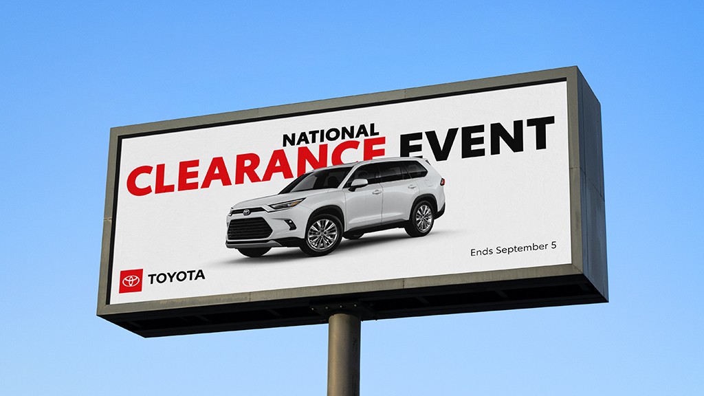
Utilize red strategically in a layout to bring focus to key elements.
For bolder expressions, add red to backgrounds, but be careful to not overwhelm the composition.
In our brand color palette, the boldness of Toyota Red is contrasted with simple yet functional shades for a balanced look and feel in our communications.
Gray may be used as a secondary color in headline and body text when sufficient contrast can be maintained for legibility.
White space allows for information to breathe and often promotes greater visibility and impact.
Black can be used in typography or as a background in digital applications when contrast is required.
-
Digital
-
Print
Hexadecimal codes are a six-character shorthand for their equivalent RGB values. HEX codes are often the preferred notation for web and HTML.
RGB stands for Red, Green and Blue, the colors of light combined on screens to display the digital color spectrum. RGB values are interchangeable with HEX codes.
CMYK stands for Cyan, Magenta, Yellow and Key (black), the four standard inks mixed during the printing process. CMYK should be used for all standard print applications.
PMS stands for Pantone Matching System. PMS colors are a single premixed ink color, which allows brand colors to be printed with total accuracy, no matter the printer.

