Link copied to clipboard.
Color Profile
Color Profile

Our custom Color Profile is designed to give our vehicles a clean, dynamic look, while bringing people into Toyota's optimistic world.


A city image with colorful buildings and plants, two couples, and a Grand Highlander. Three vertical lines divide the image into sections where the color changes in saturation, warmth and contrast.


Link copied to clipboard.
Color Fundamentals
Color Fundamentals

Warm, rich and vibrant. Toyota’s unique Color Profile infuses energy, optimism and wonder into every image. At the core of this approach are three key factors: saturation, warmth and contrast.


A woman in a white tank top and yellow skirt stands in front of a blue vehicle on a rooftop with a colorful mural.

Saturation

Increasing the color saturation creates a heightened sense of reality for our viewers.


Three trucks parked by forest trails with golden sunlight coming in through the trees.

Warmth

Leaning toward the warm side of the spectrum conveys a sense of friendliness.


The Mirai in Hydro Blue is parked at a hydrogen pump.

Contrast

Enhancing the light and dark values adds emphasis and focus.


All color corrections should maintain the vehicle’s integrity and be product-correct.


Saturation

Accentuating saturation of the entire scene, including people, wardrobe and environment, adds energy and helps the vehicle stand out.


A slider divides an image of a woman and a vehicle in half, showing what it looks like when color saturation is increased to the image.

Before Saturation

After Saturation


Warmth

By enhancing the natural light from sunrise to sunset, our Color Profile embraces the full spectrum of color hues, while bathing everything in a warm glow.


A slider divides an image of three trucks in a sunlit forest in half, showing what it looks like when a warm glow is added to the image.

Before Warmth

After Warmth


Contrast

Optimizing contrast in an image brightens the highlights and deepens the shadows, creating more definition. In addition, contrast can be leveraged to give the vehicle dimensionality and draw attention to vehicle details.


A slider divides an image of a Mirai at a hydrogen pump in half, showing what it looks like when the contrast is increased to the image.

Before Contrast

After Contrast


A Toyota Tundra parked in front of a cabin. A dad grabs a cooler from the trunk with his daughter and dog.


Set Images up for Success

Achieving our Unmistakably Toyota look and feel starts with decisions made in pre-production. Learn how lighting, composition, narrative and art direction set the final images up for success in our Photography Guidelines.


Link copied to clipboard.
Photo Application
Photo Application

There’s more than one way to get ideal results. Here are a few simple directions to get you started.


Applying the Color Profile

Below are some basic adjustment layers available in Adobe® Photoshop that can be used to alter an image’s Color Profile. Of course, numerous other tools and methods are available across Photoshop and other applications.


A rainbow gradient with an arrow slider.

How to Add Saturation

“Hue/Saturation” allows you to boost the saturation of all colors or individual colors. “Vibrance” selectively boosts only the most muted colors.


A blue-and-yellow gradient with an arrow slider.

How to Add Warmth

“Color Balance” can be used to add warm colors such as yellow to the highlights. Alternatively, select a “Warming Filter” from the “Photo Filter” adjustments.


A black-and-gray gradient with a white curve graphic.

How to Add Contrast

“Curves” uses multiple adjustment points to manipulate the full tonal range. “Levels” and “Brightness/Contrast” are more basic options but provide less customization.


Photo Examples

The following examples show how applying saturation, warmth and contrast properly can take Toyota imagery from muted to vibrant.


A couple sits next to their Corolla Cross, overlooking the mountains on a sunny day. A slider divides the image in half, showing what it looks like when color profile is added to the image.

Before Color Profile

After Color Profile


The Tundra TRD Pro kicks up dirt in the desert. A slider divides the image in half, showing what it looks like when color profile is added to the image.

Before Color Profile

After Color Profile


A vehicle interior with a red dashboard and views of the mountains through the windshield. A slider divides the image in half, showing what it looks like when color profile is added to the image.

Before Color Profile

After Color Profile


Link copied to clipboard.
Video Application
Video Application

Every video we make should feel like a part of Toyota’s world, regardless of its unique creative story. From when the director calls "action" to the final delivery of a commercial, our Color Profile should be top of mind across three key milestones in the process to achieve successful results.


Production Process

Accurately applying our Color Profile in video requires the collaboration of everyone involved in the production. It starts with loading the LUT and ends with bringing the Color Profile to life in every color grading session.


Camera icon.
Load the LUT
STEP ONE

The Look Up Table (or LUT for short) is just the first step in creating our Color Profile. Think of it as the modern version of film stock. Loading it into the camera helps the director and cinematographer see how the environment looks through the Color Profile, informing color choices and lighting techniques on set.


Clipboard icon.
Make key decisions
STEP TWO (OPTIONAL)

After loading the LUT, the director and cinematographer have the option to create a CDL (Color Decision List). If a CDL is used, it should always align with our Color Profile and match the Unmistakably Toyota look and feel.


Computer software icon.
Do the final grading
STEP THREE

The last and most important step is the final color grading. This is the process by which the colorist reviews the picture in detail and goes shot to shot, making adjustments to ensure consistency across the footage.


Video Example

In video, the Color Profile builds in layers across the production process. The LUT gives an overall sense of things, but the final color grading is where the true magic happens. Get a feel for the transformation in the example below.


Work with your colorist to add saturation, warmth and contrast, following the same approach we use for still imagery.


From left to right: Raw Footage, LUT Applied, Final Graded Footage


Link copied to clipboard.
Color Refinements
Color Refinements

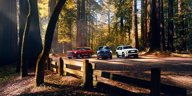
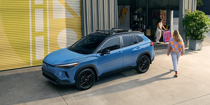
Some images might need additional adjustments to make Toyota’s color fully come to life. The following tips and watchouts will help our vehicles pop in every weather and lighting condition.


Adjustments in Action

In addition to saturation, warmth and contrast, each image has opportunities for further optimizations. See some examples below of how color might be fine-tuned for an image’s specific needs.


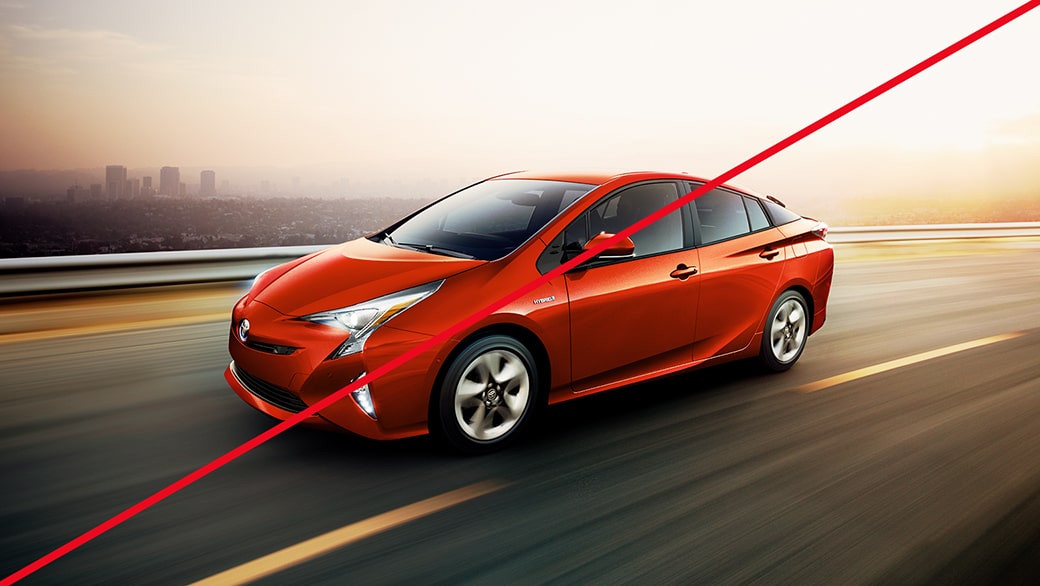
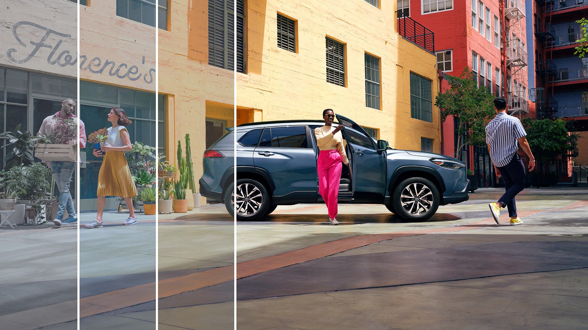
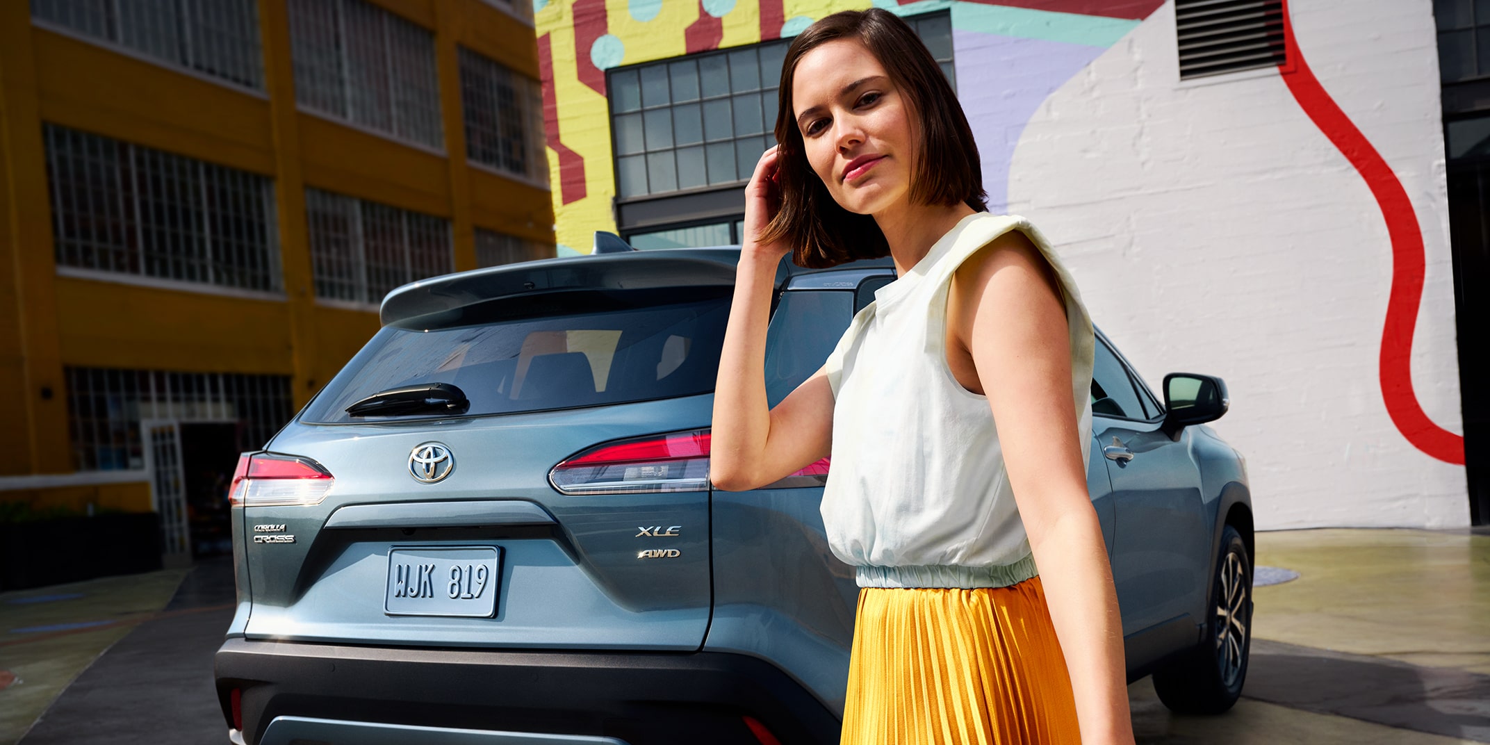
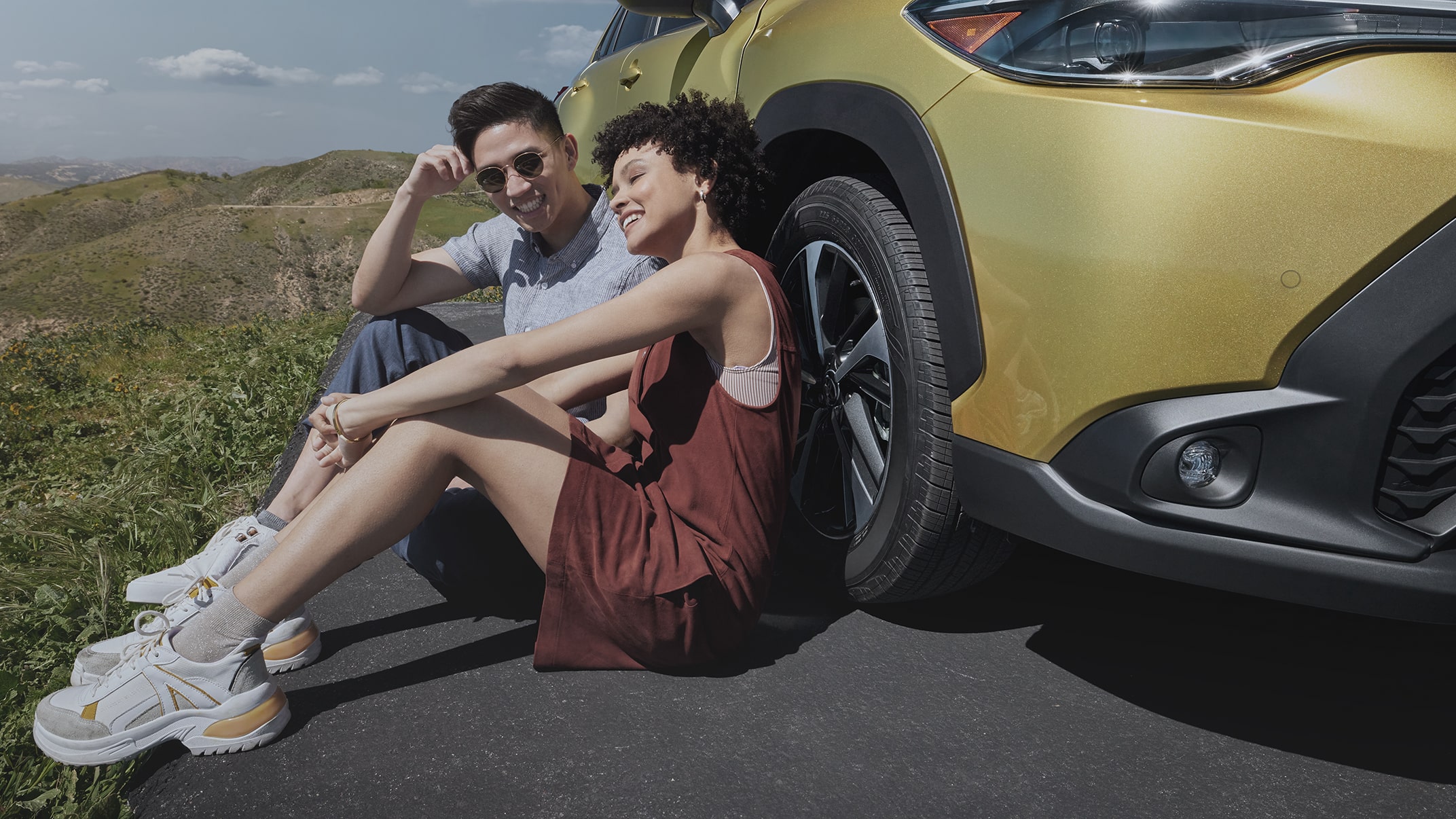
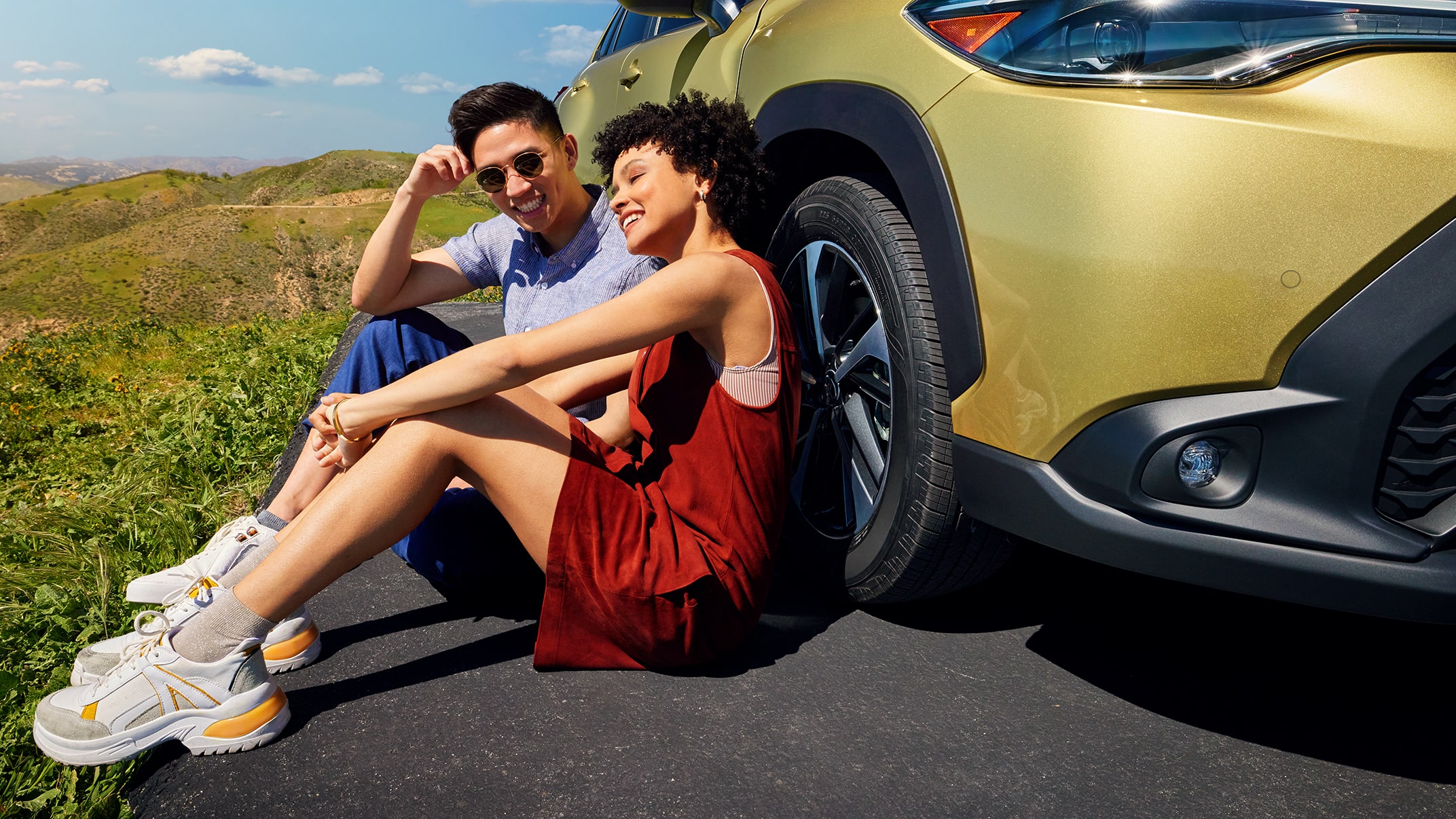
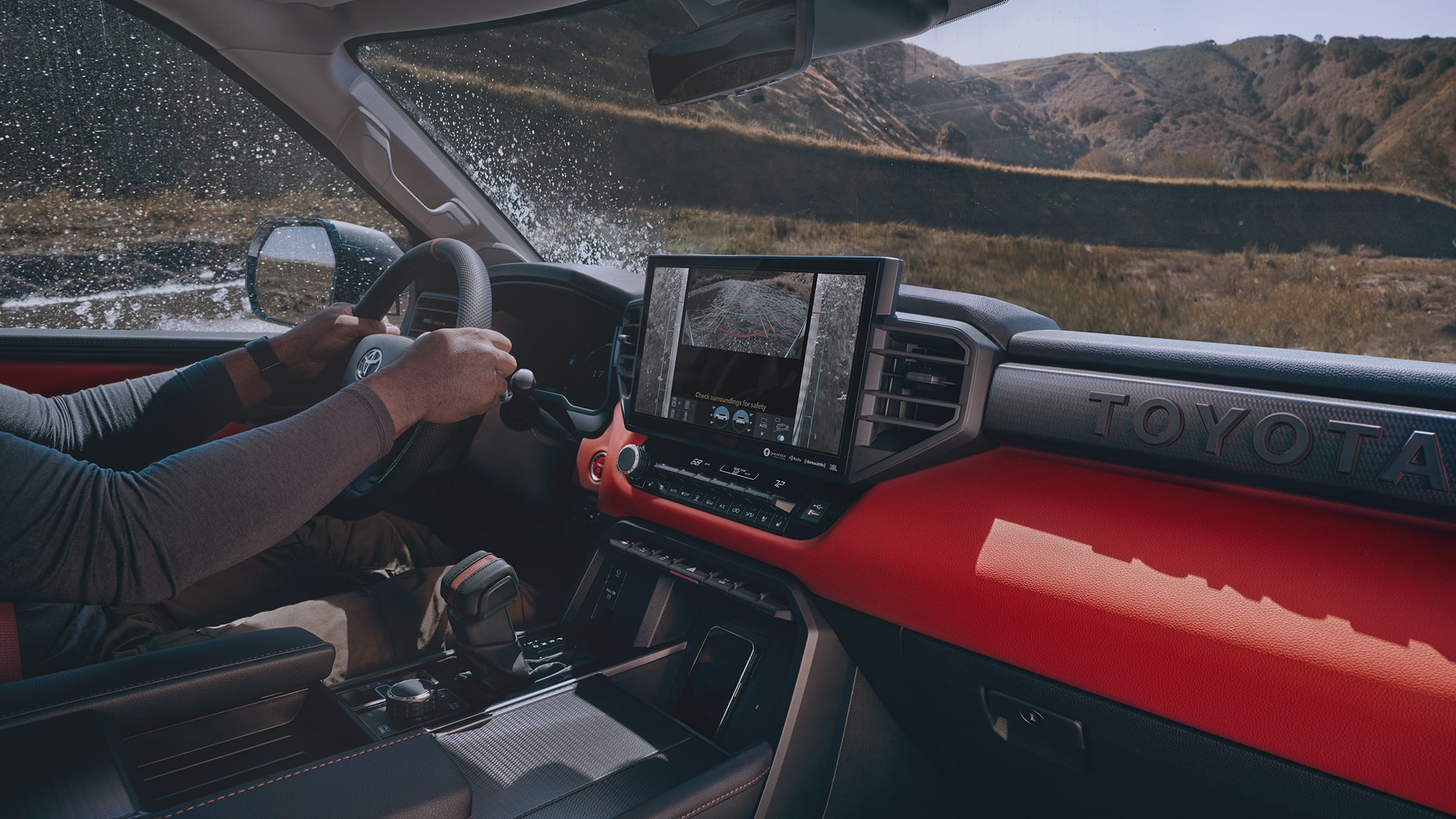
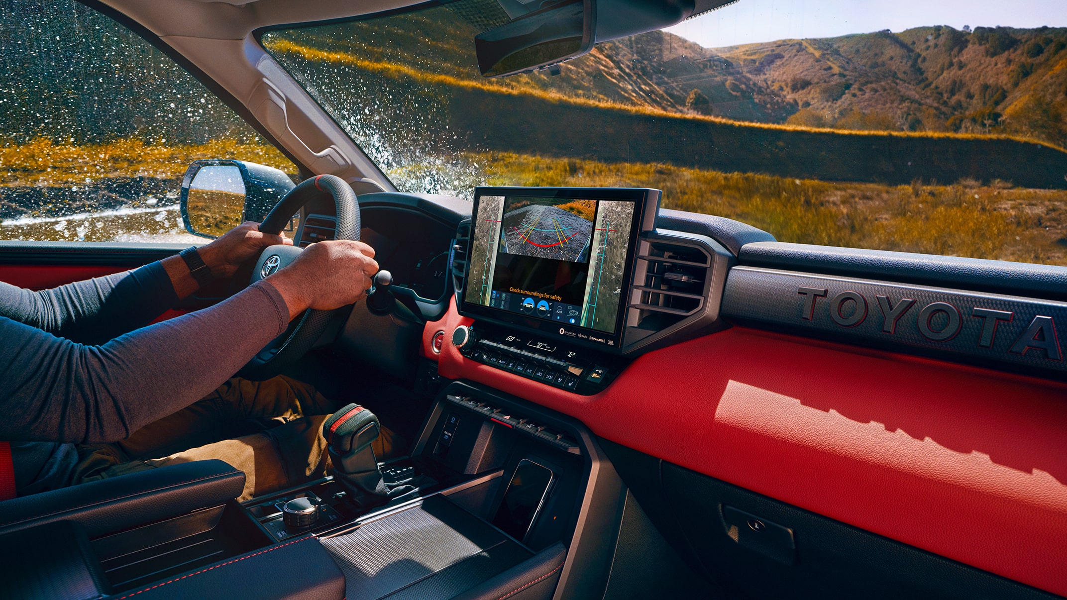
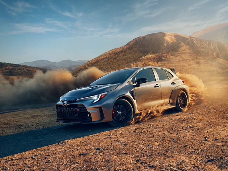
The contrast in this image makes the vehicle pop, drawing attention to the details. The saturated color in the environment also helps the vehicle stand out.

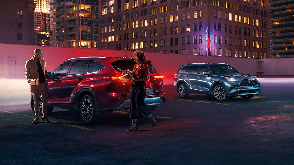
Nighttime shots are at risk of becoming too dark or gloomy. This image adds excitement by playing with reflections, headlights and other lighting cues.

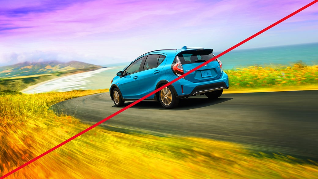
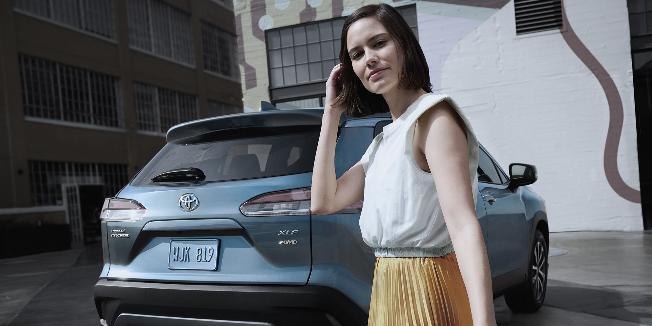
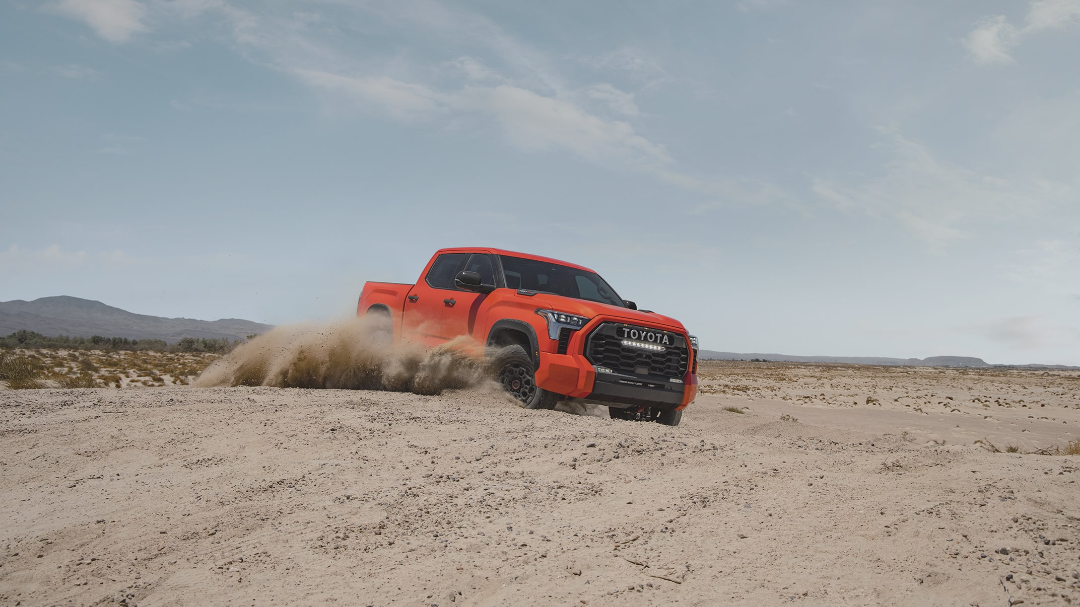
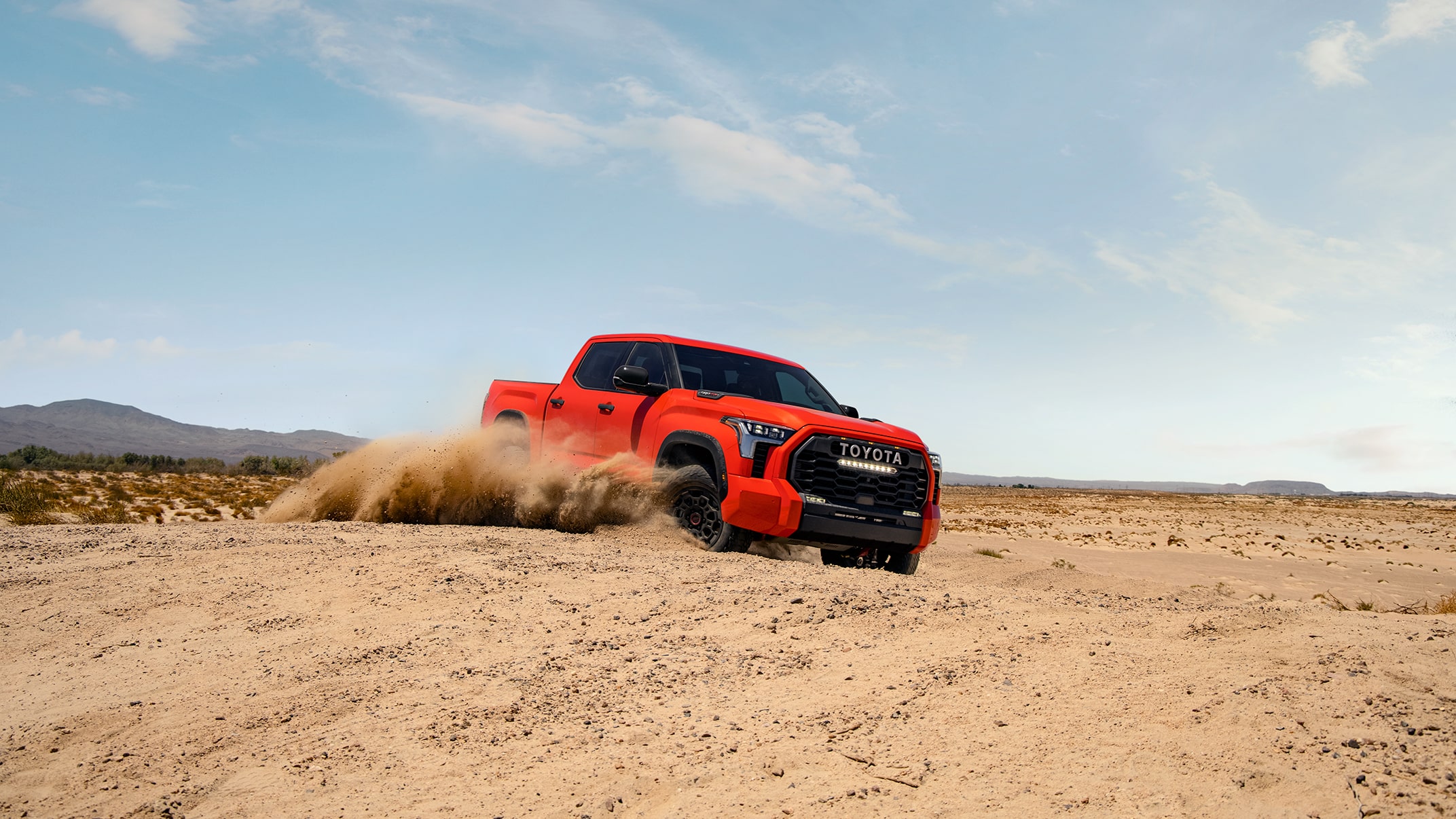
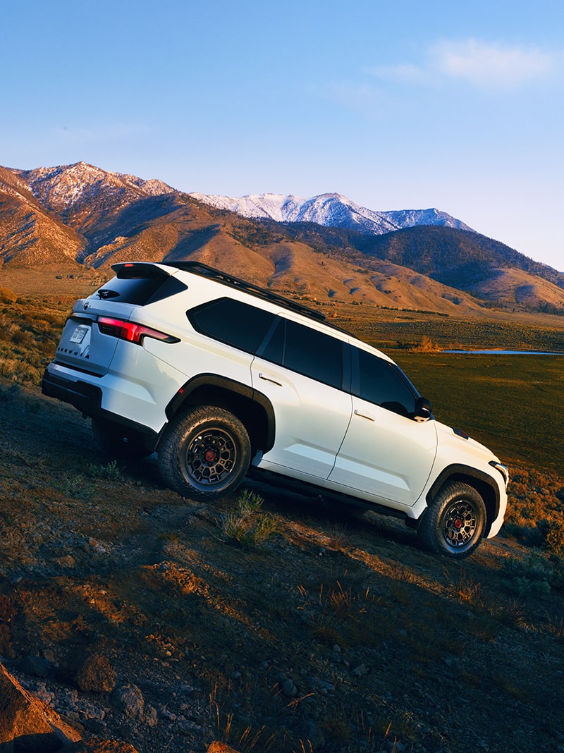
This image takes full advantage of the low, warm light found in golden hour to create a bold, striking image.


Watch-Outs

Here are some tips for what to avoid so we can stay true to our Color Profile and create consistency across all channels.


An image with motion blur and lighting that obscures the shape of a red vehicle, showing incorrect usage.


Don’t use color and lighting adjustments that interfere with product correctness, such as changing the paint color or distorting vehicle body lines.


A technicolor image of a vehicle with purple sky and yellow grass, representing excessive color editing.


Don’t over-edit the image or video to the point that it feels unnatural or departs from reality.


An image of a dark gray vehicle in a dark gray garage, showing incorrect background choice.


Don’t let the vehicle merge with the background or get lost in the environment. This also applies to nighttime scenes that feel too dark overall.


An image of an orange vehicle in a black-and-white photograph, representing incorrect style choice.


Don’t use overly artistic styles, effects or decisions that don’t align with the Unmistakably Toyota look and feel.


Link copied to clipboard.
Resources
Resources


Look Up Table (LUT)

Our LUT is available for download in .cube file format accompanied by technical instructions and specifications.


Photography Guidelines

Learn more about our photography approach and how to capture vehicles in the Toyota style.


FAQs


  • A four-page pdf that includes detailed workflows and setup instructions for DIT, Dailies, VFX and Finishing Color is included with the LUT download.
  • This LUT will create Rec709 Gamma 2.4 full-range images that can be saved for the Editorial Movie file.

In addition to the LUT, there is another layer of color correction that needs to be applied to achieve the right look and feel. Always review each shot in detail in the final grading session, adjusting as needed to match our Color Profile and ensure consistency.