Link copied to clipboard.
Photography
Photography

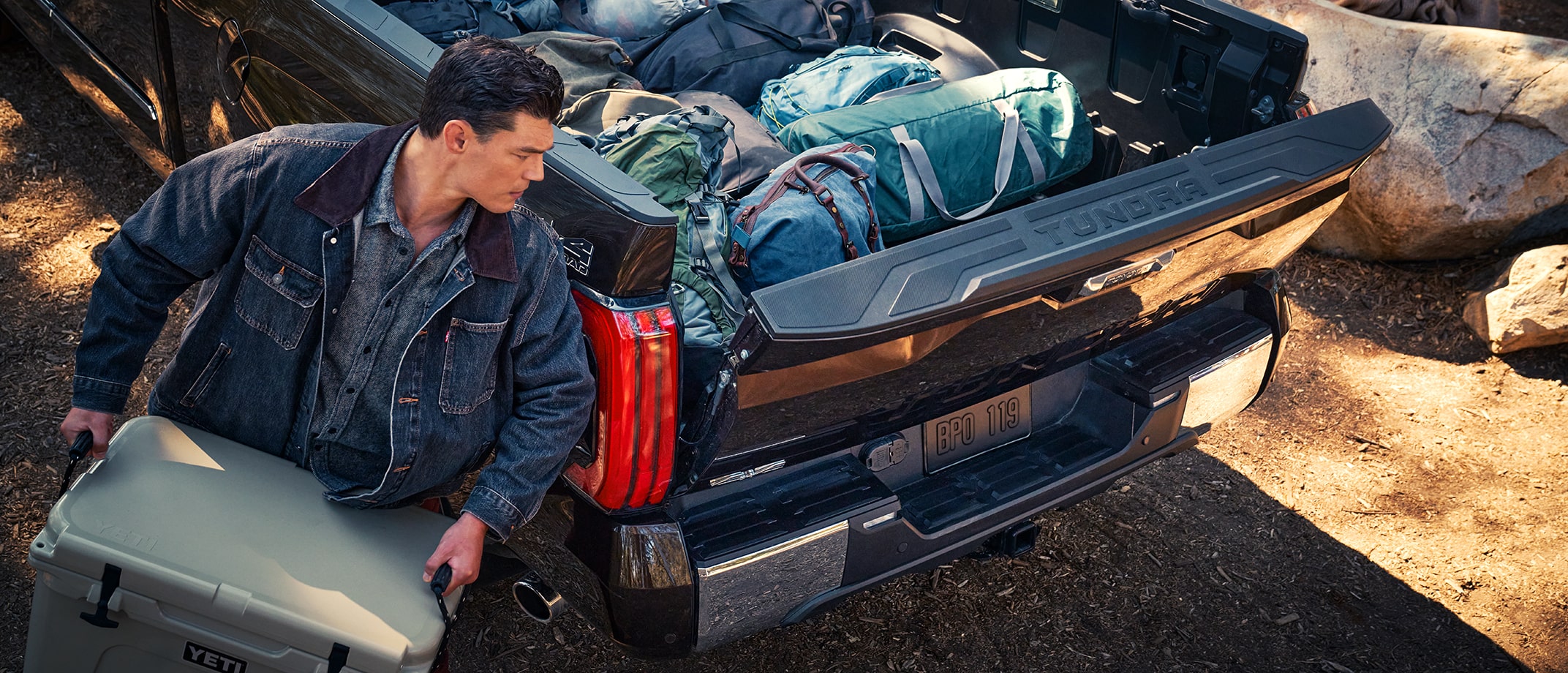
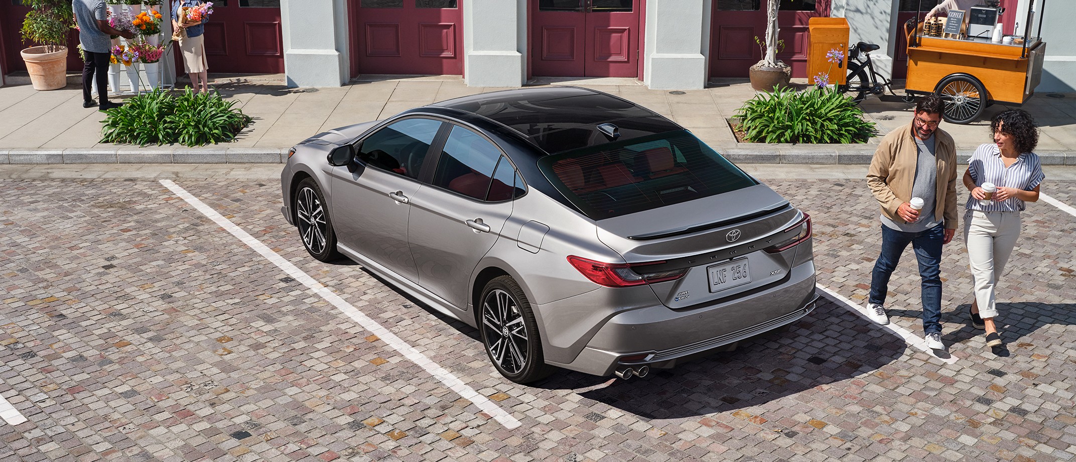
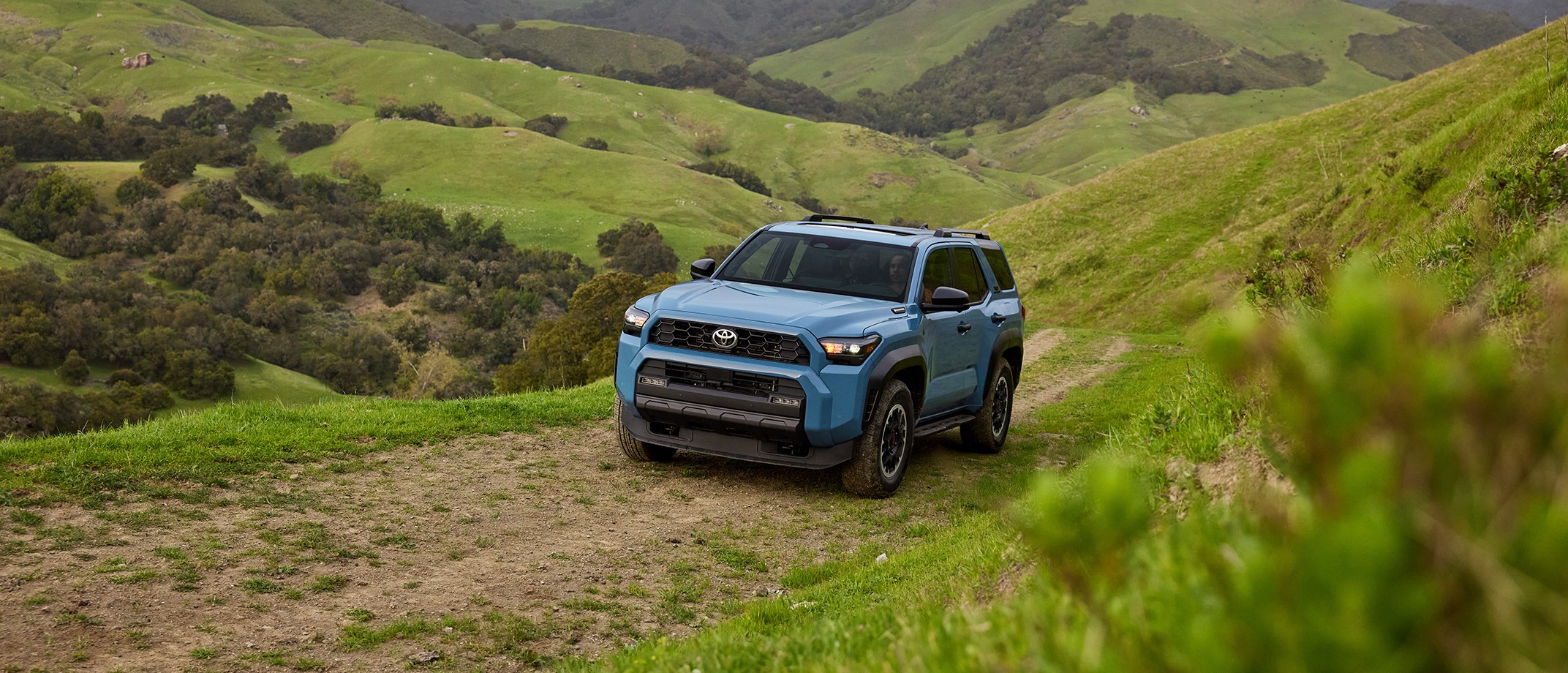
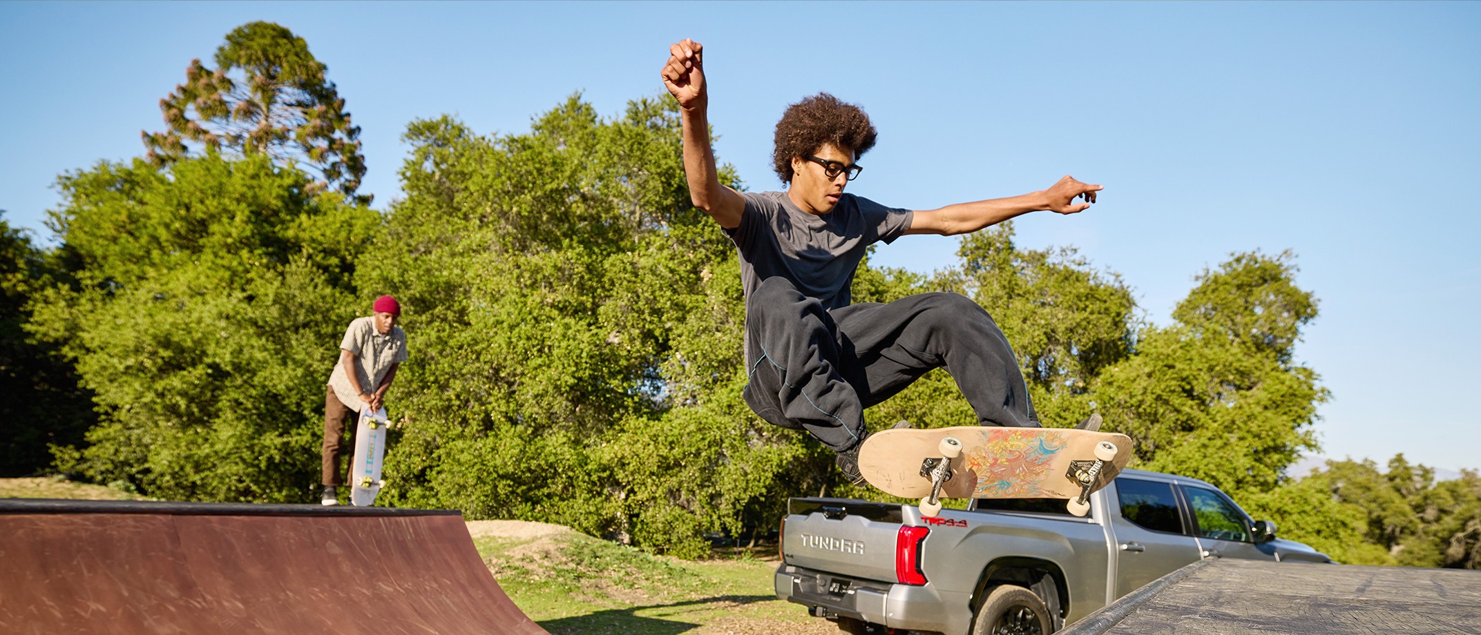
Our imagery evokes a positive world where Toyota vehicles are used to authentically embrace the wonderful of every day.


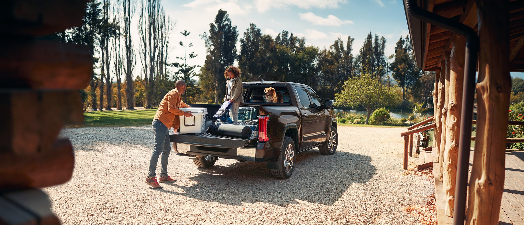
A Toyota Tundra parked in front of a cabin. A dad grabs a cooler from the trunk with his daughter and dog.


Multiple Vehicles. One Brand.

The Toyota brand is a constant across everything we do. But, with a wide range of vehicles, each with its own personality and uses, honoring both the brand and vehicle expression at the same time can sometimes be a challenge. These guidelines are designed to help you strike that balance.


Woman icon.
Expressing the Brand

The Toyota world comes alive in every image we create. From concept to color, everything is infused with the excitement and optimism synonymous with our brand. We achieve this by using the same approach, core tenets, color profile and technical guidelines across all imagery.


Vehicle icon.
Celebrating the Vehicle

Within the Toyota world, each vehicle has its own personality, purpose and appeal. To connect authentically with such a range of audiences, we craft vehicle-specific stories that are flexible and diverse across products, people, environments and lifestyles.


Link copied to clipboard.
Brand Approach
Brand Approach

As a brand, our photography appears natural and relatable to a diverse audience who can easily imagine themselves in the scenes we capture.


Be relatable.
Be relatable.

Create an emotional connection with the audience by using familiar narratives and scenes.

Lead with authenticity.

Exude authenticity with every image, across vehicles, narratives and talent.
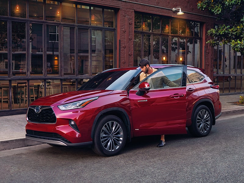
Keep it natural.
Keep it natural.

Embrace spontaneity by catching subjects in the moment, so they don’t seem forced or posed.
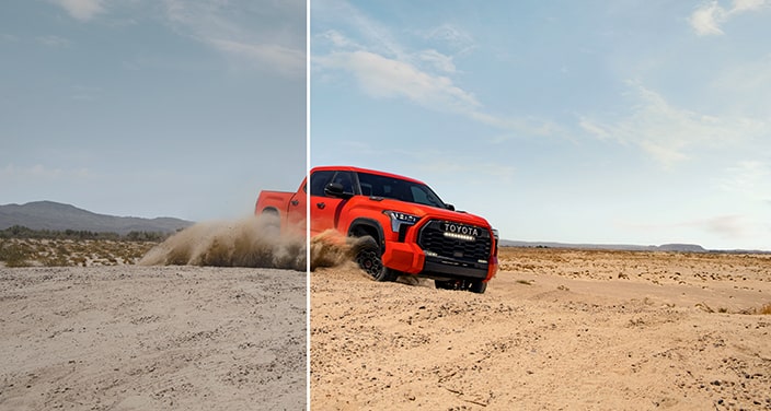


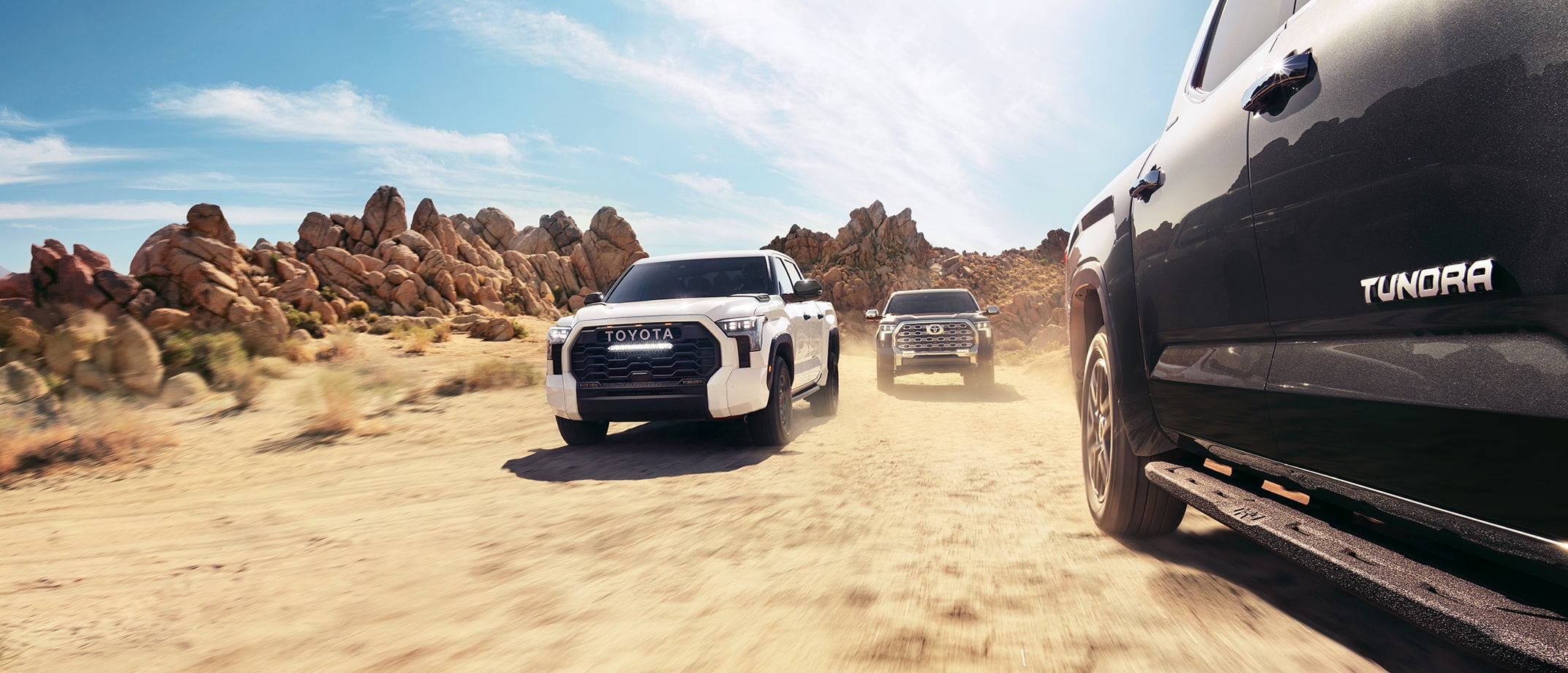
A white line divides an image of a vehicle in a desert landscape. The colors on one side of the line are faded; on the other side, they are bright and clear.
A World of Color All Our Own

Warm, rich, vibrant. The colors in our images express our brand’s energy, optimism and wonder. Dive deeper into Toyota’s unique look with our Color Profile Guidelines.


Link copied to clipboard.
Core Tenets
Core Tenets

Every image is a chance to reinforce what makes Toyota unmistakable. Foundations such as our Creative Lens, Sensibility, Values and Principles should ultimately guide all our stories. With this in mind, consider the following critical objectives when developing a concept.


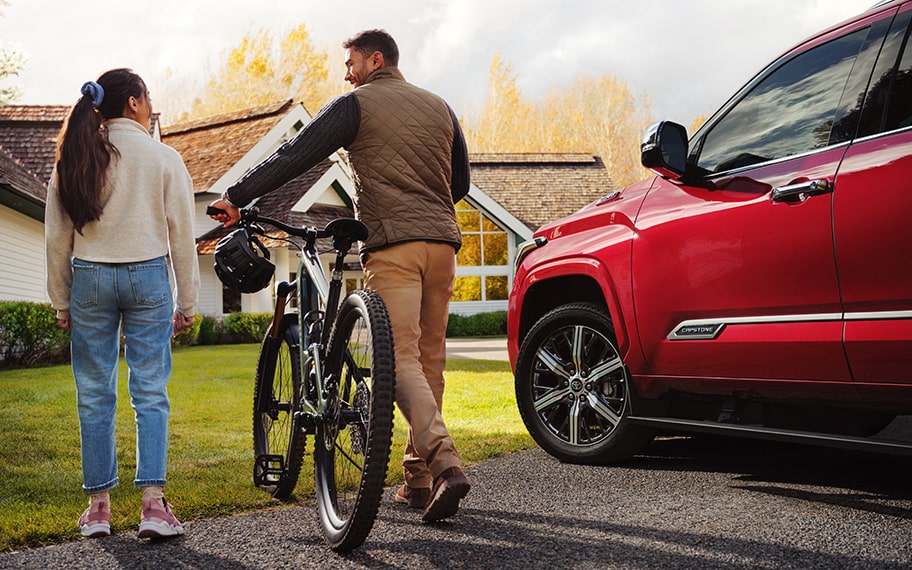
A couple pushing a bicycle in the front yard of a house with a red vehicle parked in the driveway.

Every story is within reach.

Make images believable by ensuring all scenes are believable and attainable.


A father and daughter having a snowball fight in a winter landscape.

Every moment isn’t perfect.

Include some spontaneous moments where things don’t go as expected for a fun and authentic output.


A family in surf gear with a surfboard. The mom and dad assist their child as they walk toward the ocean. The tail end of a Tundra can be seen in the foreground.

Every body is invited along.

Deliver on our commitment to inclusivity by representing our diverse audience across our portfolio of images.


A young child holding a stuffed animal gets into a vehicle with their dad in the background.

Every day has some wonderful.

Embrace the wonderful moments in life, big and small, by featuring relatable and emotionally resonant narratives.
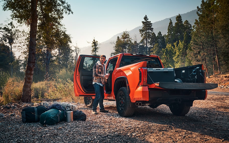


A man unloads gear from a Tundra TRD Pro, with woods and mountains in the background.

Every detail makes sense.

Choose lifestyle details, talent and locations that work together and make sense for the target audience.
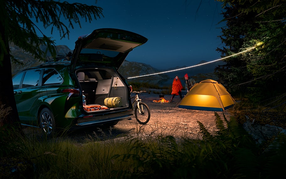


A Sienna is parked in front of a campsite at nighttime.

Every vehicle enables the story.

Give every narrative purpose by featuring the vehicle in an integral role in the characters’ lives.


Link copied to clipboard.
Vehicle Narratives
Vehicle Narratives

Our narratives embrace the individuality of our vehicles. Just like we make vehicles with different peoples’ needs in mind, we craft scenes for specific audiences. Learn how the product, people and environment in each image work together to maximize vehicle expression while still staying true to our brand.


Telling a Story With Staging

Product positioning provides a solid foundation for visual storytelling. The angle of the vehicle and its interaction with drivers and environments can be a powerful way to communicate the vehicle’s essence. Check out some great examples below.


This shot uses a low angle to emphasize the climb across the rugged terrain, showcasing how RAV4 is ready for any adventure.

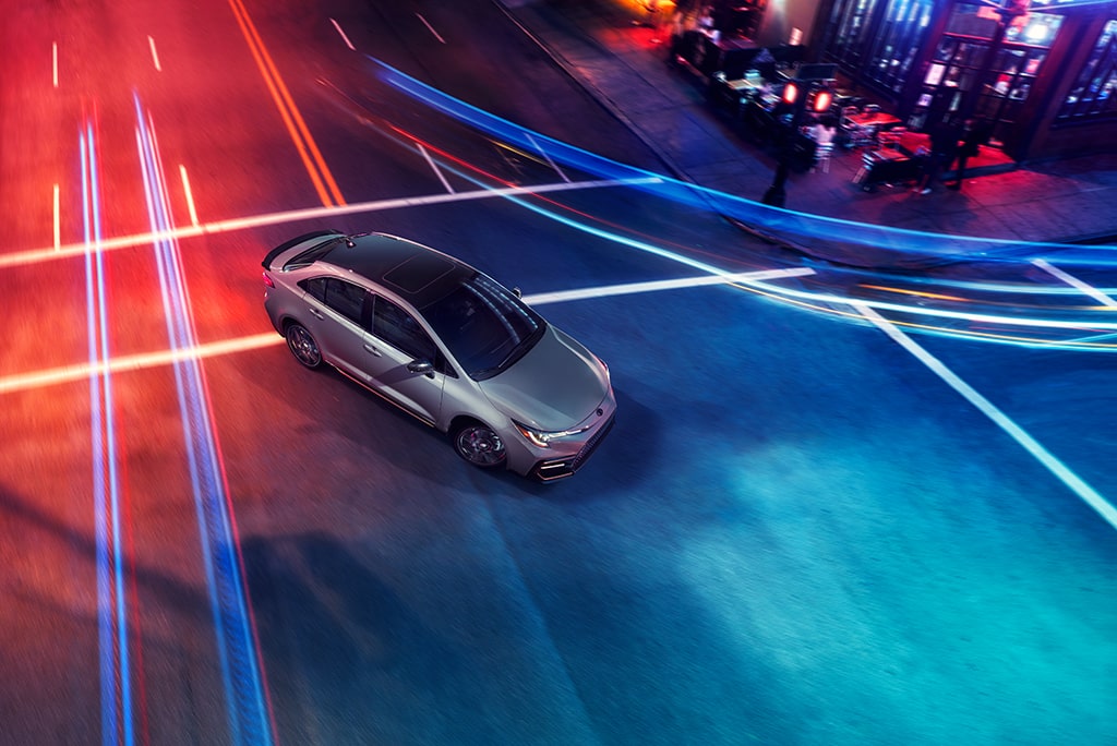
A high angle plays off the dynamic lines in this image to create a stylish, modern feel for Corolla’s fun-to-drive personality.
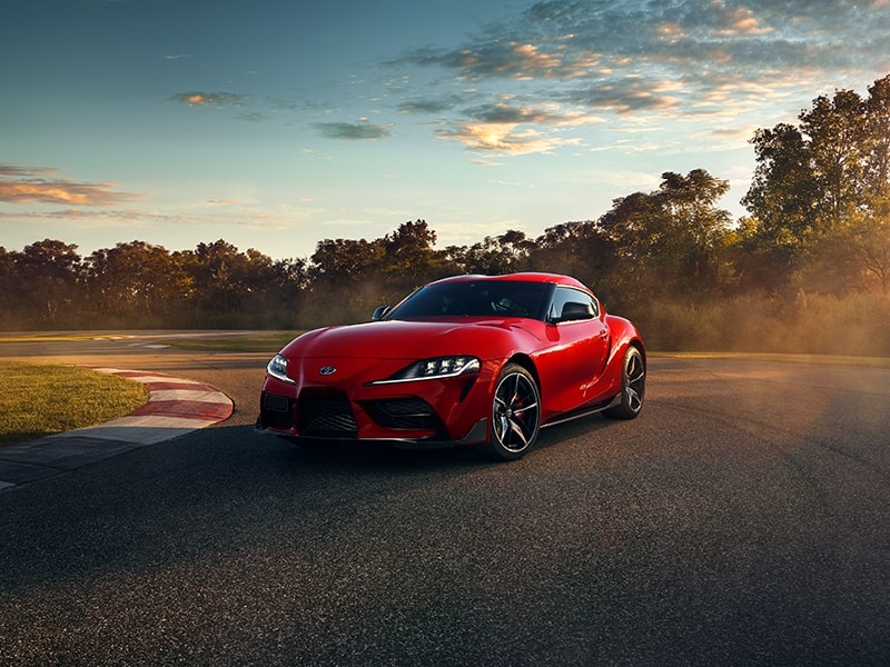
Making the driver’s side a focal point in this image helps capture the thrill of driving Supra.




A group of friends hanging out in the woods next to a Toyota truck.
Accentuate Each Vehicle’s Essence

Whatever vehicle you are featuring, learn about its essence so you can create a unique narrative that makes it shine.


Creating a Role for Every Vehicle

Each Toyota vehicle has its own expression and is an invaluable part of every story. While the vehicle is always integral to the narrative, it can be shown in various roles.


Embracing Diversity

The people in our imagery should always be relatable to the vehicle’s target audience, connecting through authentic lifestyle details.


Capturing the Places We Go

The environments in our imagery evoke a culture of discovery in moments big and small, aspirational and everyday.


Narrative Watchouts


An image of a woman and dog on top of a vehicle used as an example of an incorrect narrative.


Avoid unnatural and stylized posing. Our drivers should be relatable and not feel like "models."


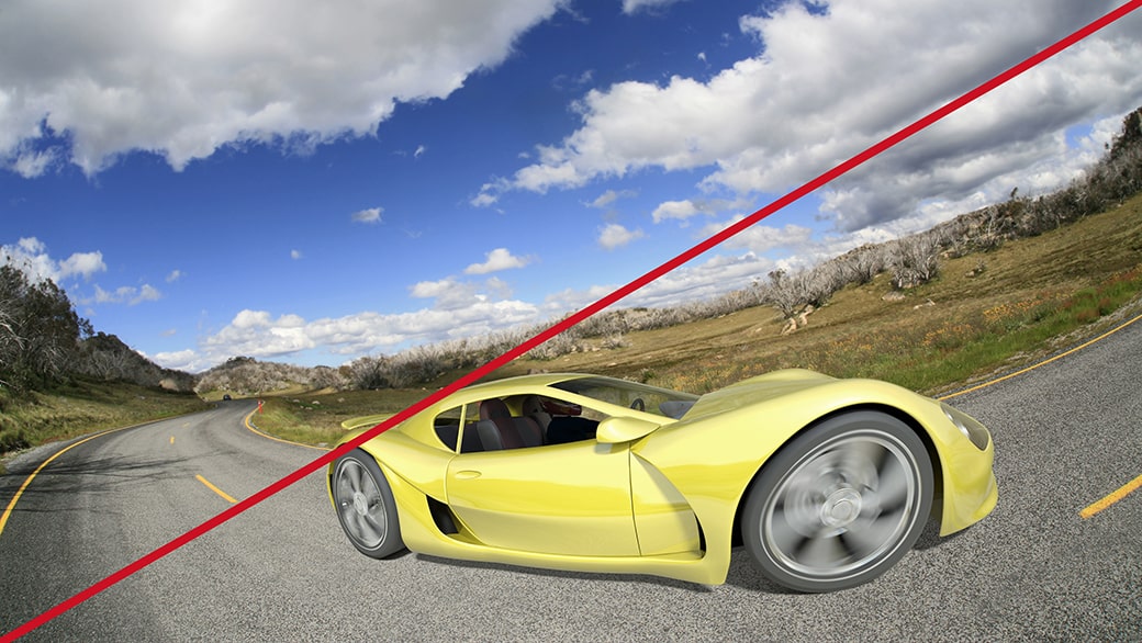
A distorted image of a bright yellow racecar used as an example of an incorrect narrative.


Don’t use distorted lensing and extreme angles because they pull focus from the story.


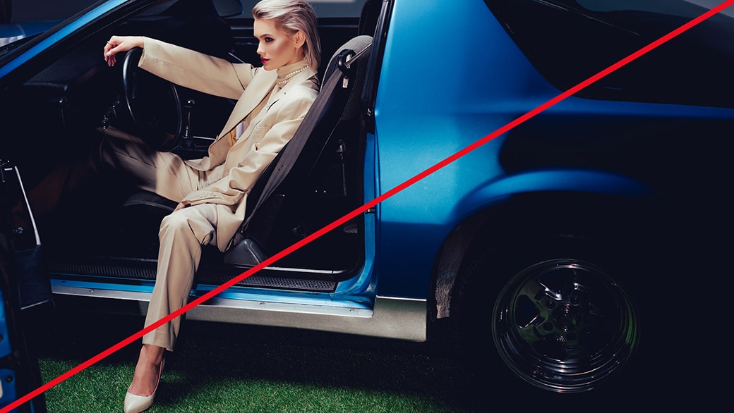
An image of stylish model posed inside a sleek car used as an example of an incorrect narrative.


Avoid artificial situations and inauthentic environments that feel removed from everyday life.


An image of a teenage boy leaning out of a car window holding a bottle used as an example of an incorrect narrative.


Don’t depict drivers or passengers engaging in unsafe behavior.


Always check with legal for actual disclaimers.


Link copied to clipboard.
Technical Guidance
Technical Guidance

We elevate our stories visually with thoughtful arrangements, clear focus and natural lighting.


Composition

Thoughtfully arranged compositions elevate our ability to tell stories with variety and emotional impact. Embrace a range of distances, coordinated to create visual variety across a shoot.


A close-up shot of LED headlights.

Close-Ups

Close-up shots show details and create visual tension.
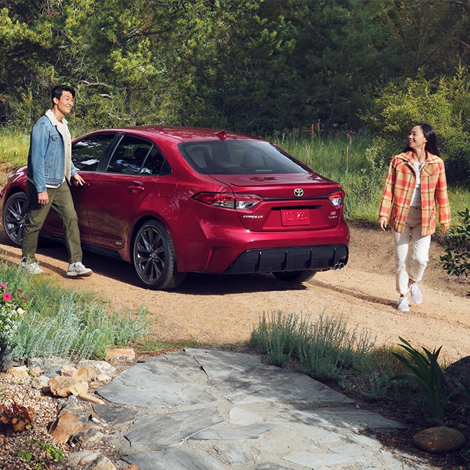


A woman walking out of a shop to get into her Toyota vehicle, parked right outside.

Mid-Range

Mid-range shots demonstrate what it’s like to engage with the product.
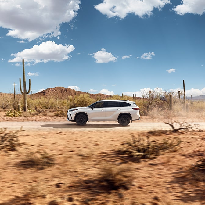


A Sequoia parked in a desert landscape, among cactus and clear blue skies.

Wides

Wide-angle shots evoke a sense of place and the spirit of discovery.
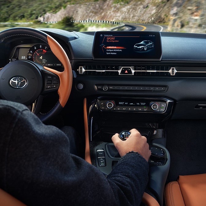


Focus

Proper use of focus will ensure that our photography always appears natural and is free from unnecessary visual noise.


An interior shot of a Toyota vehicle.

Tight Shots

Use sharp focus to capture product details and avoid peripheral features falling out of focus.
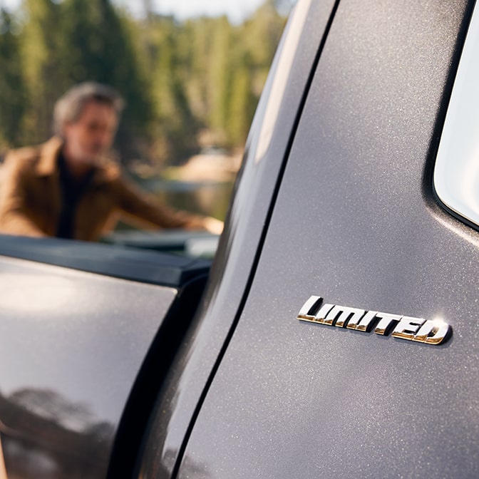


An image focused on a truck badge, with a man and woods blurred in the background.

Depth of Field

Depth of field should appear natural and be used with intention to create a focal point.
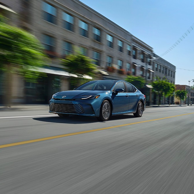


A sedan drives through a forest, the leaves blurring in the foreground.

Motion Blur

Blur should be used with purpose and restraint to convey a sense of motion.
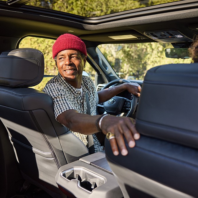


Lighting

Consistent use of naturally lit scenes will ensure that our photography always feels authentic, warm and inviting.


A woman charges her vehicle on a sunny day.

Natural Lighting

Lighting should appear to accentuate the scene naturally—outdoors or in the studio.


The front grille of a white truck on rocky terrain.

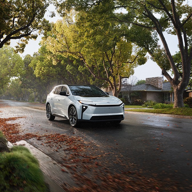
White Balance

Images should appear naturally white-balanced and not stylized.


A Toyota SUV is parked in the shadows of a building.

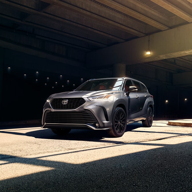
Shadows

Shadows should appear natural and not overly harsh or dramatic.


Technical Watchouts


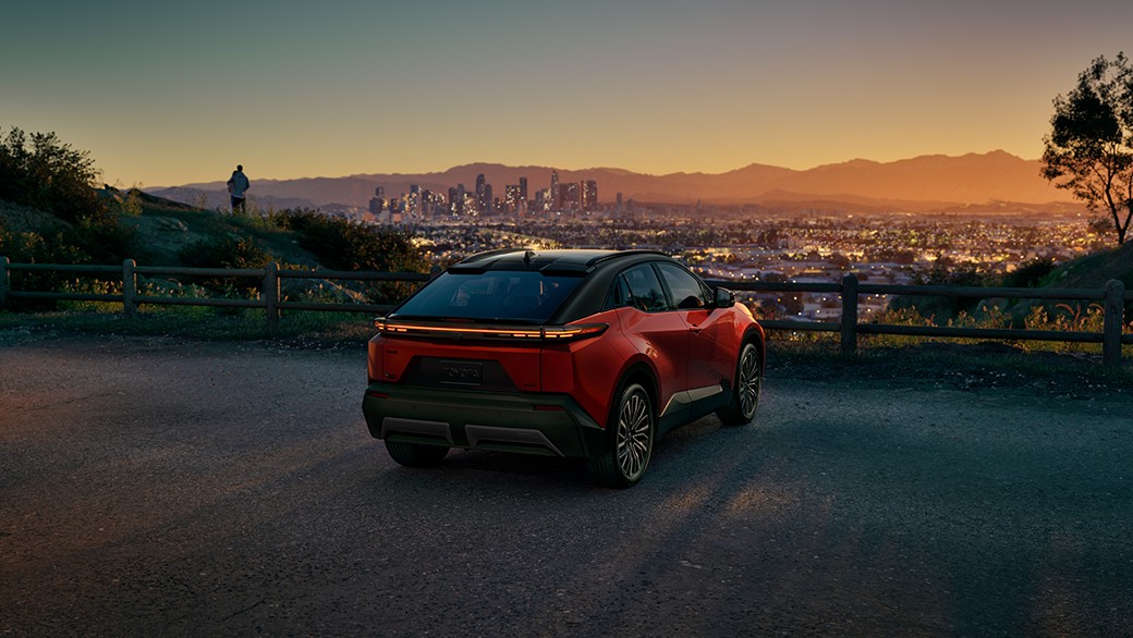
A red Toyota SUV is parked at a viewpoint, overlooking the city.


A simple, open background helps establish focal points and creates a sense of possibility.


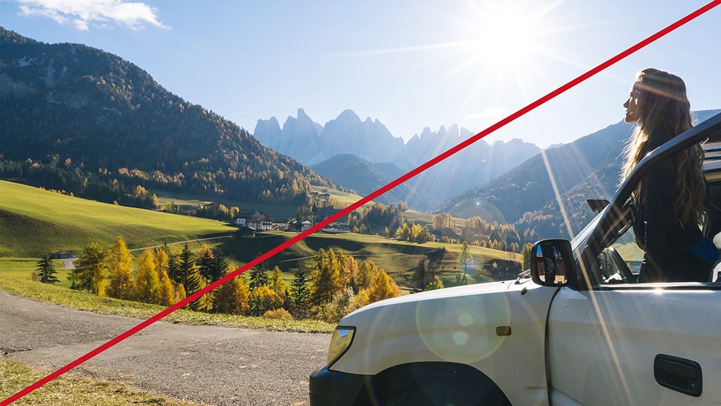
An image of a woman getting out of vehicle with a bright sun flare in the background, representing incorrect lighting.


Avoid excessive lens flares and sunbursts that call more attention to the photo than the vehicle.


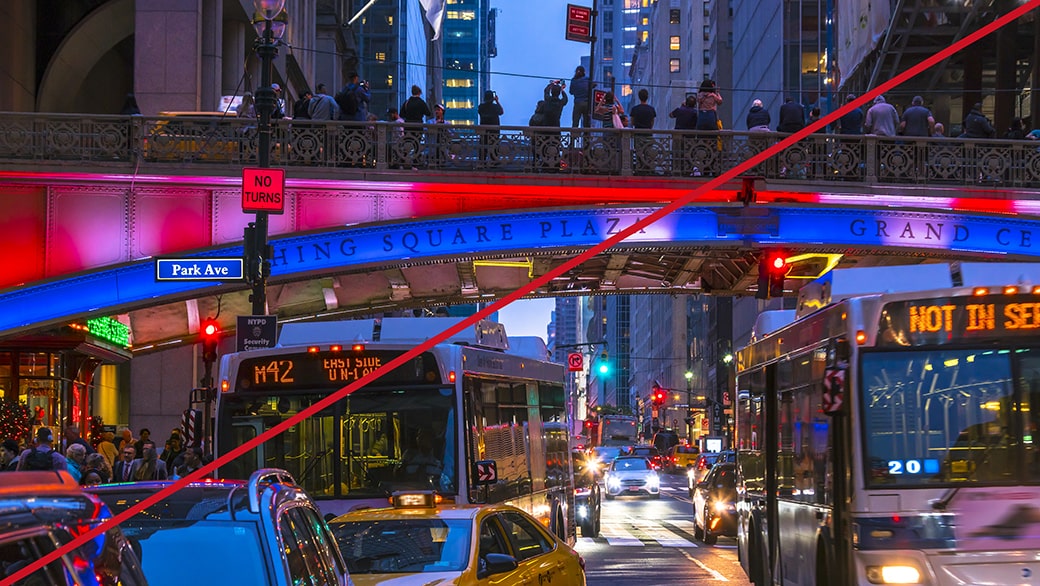
An image of a busy city scene at night with buses and colorful lights, representing an incorrect composition.


Avoid visually complex and busy compositions that distract from the primary subject.


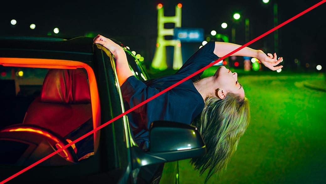
An image of a woman hanging out a vehicle with green-and-red fluorescent lighting, representing incorrect lighting.


Avoid overly dramatic or stylized lighting.


Link copied to clipboard.
Resources
Resources


Color Profile

Applying our Color Profile makes every image unmistakable. Find everything you need to know in our Color Profile Guidelines.


Brand Sensibility

Our photography approach stems from our overall brand strategy. Learn more about Toyota’s Brand Story, Creative Lens and Sensibility. 


Vehicle Essence

Celebrating our vehicles in every image starts with getting to know them. Learn what makes each vehicle in Toyota’s lineup unique.


FAQs


Always share these guidelines, as well as our Color Profile, Creative Lens and Brand Sensibility, with the photographer when briefing.

  • For information on color grading/color correction, make sure to reference our Color Profile Guidelines. We aim for a unique color look and feel in terms of saturation, warmth and contrast.
  • For video production, we also have a LUT available to help guide color choices before the final grading. Find out more about it in our Color Profile Guidelines.

Computer-generated and computer-enhanced images should adhere to the same visual standards as our photography. Care should be taken to ensure that computer-generated images appear natural and realistic.