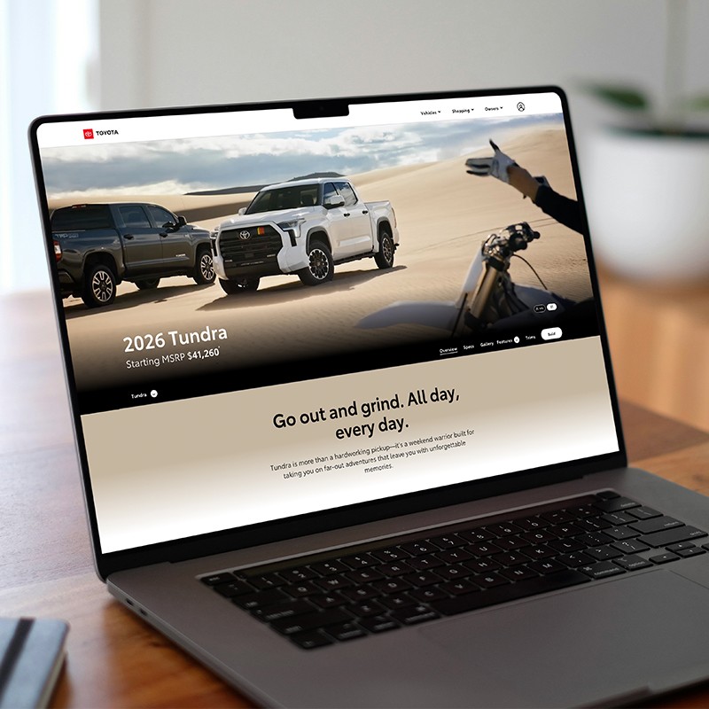
Allow the red in the logo or vehicle to pop instead of adding extra red.

Utilize red strategically in a layout to bring focus to key elements.
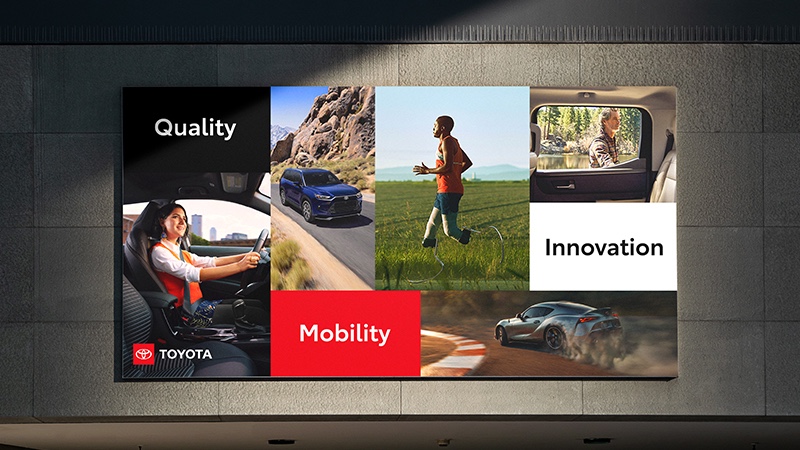
For bolder expressions, add red to backgrounds, but be careful to not overwhelm the composition.
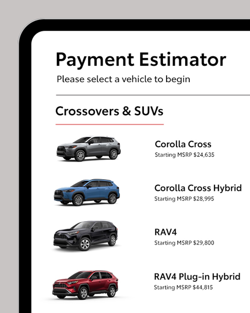
Gray may be used as a secondary color in headline and body text when sufficient contrast can be maintained for legibility.
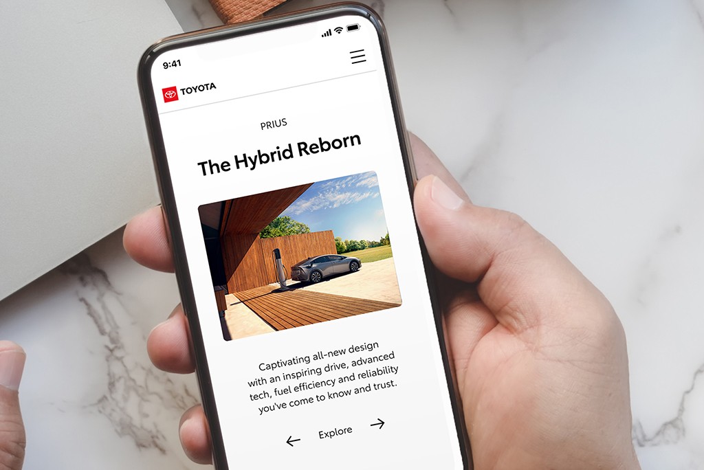
White space allows for information to breathe and often promotes greater visibility and impact.
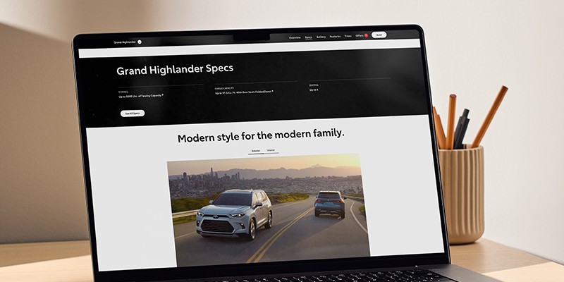
Black can be used in typography or as a background in digital applications when contrast is required.

